tuesday gold
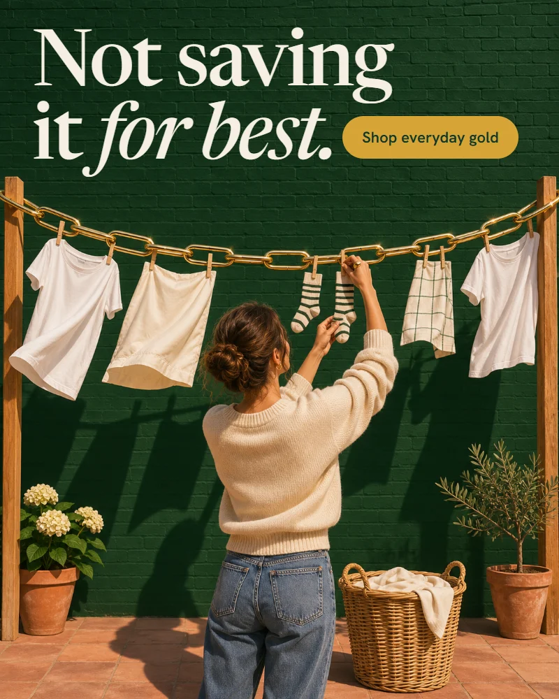
Not saving it for best.
Jewellery. Logo, packaging, store, banners, social, print
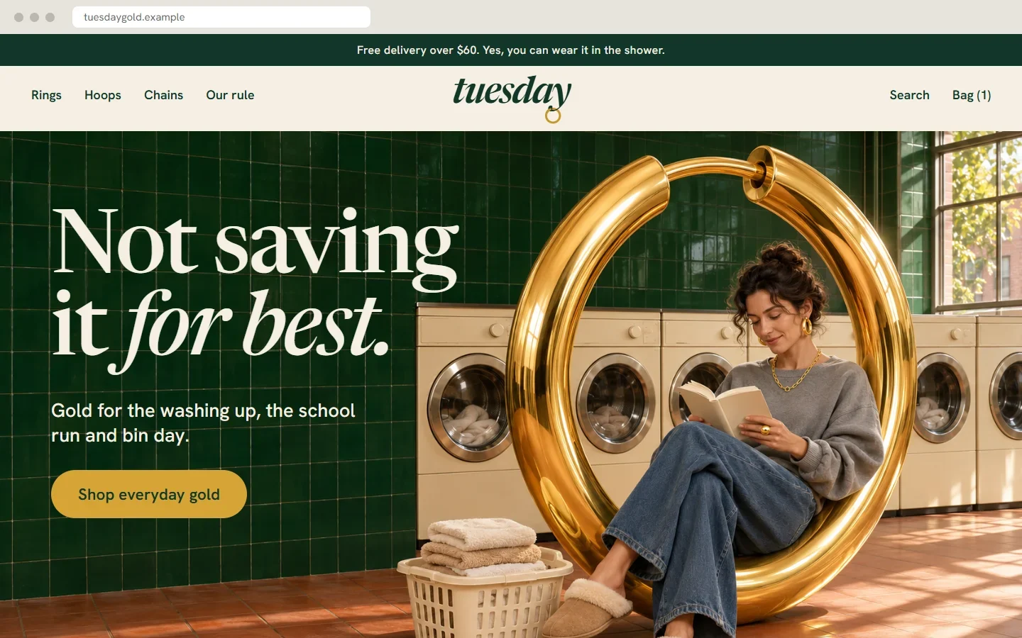
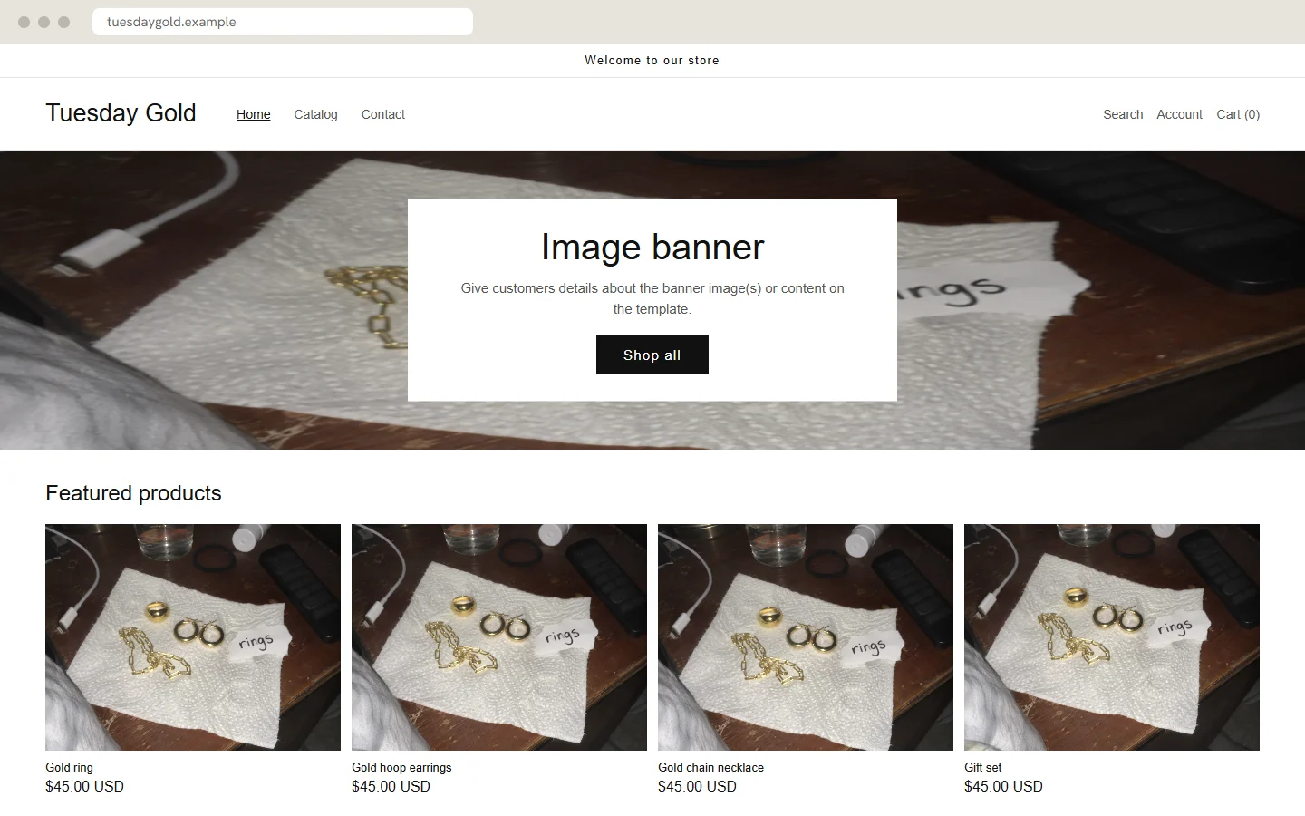 BeforeAfter
- Before
- A default theme, with one bedside photo used for every product.
- After
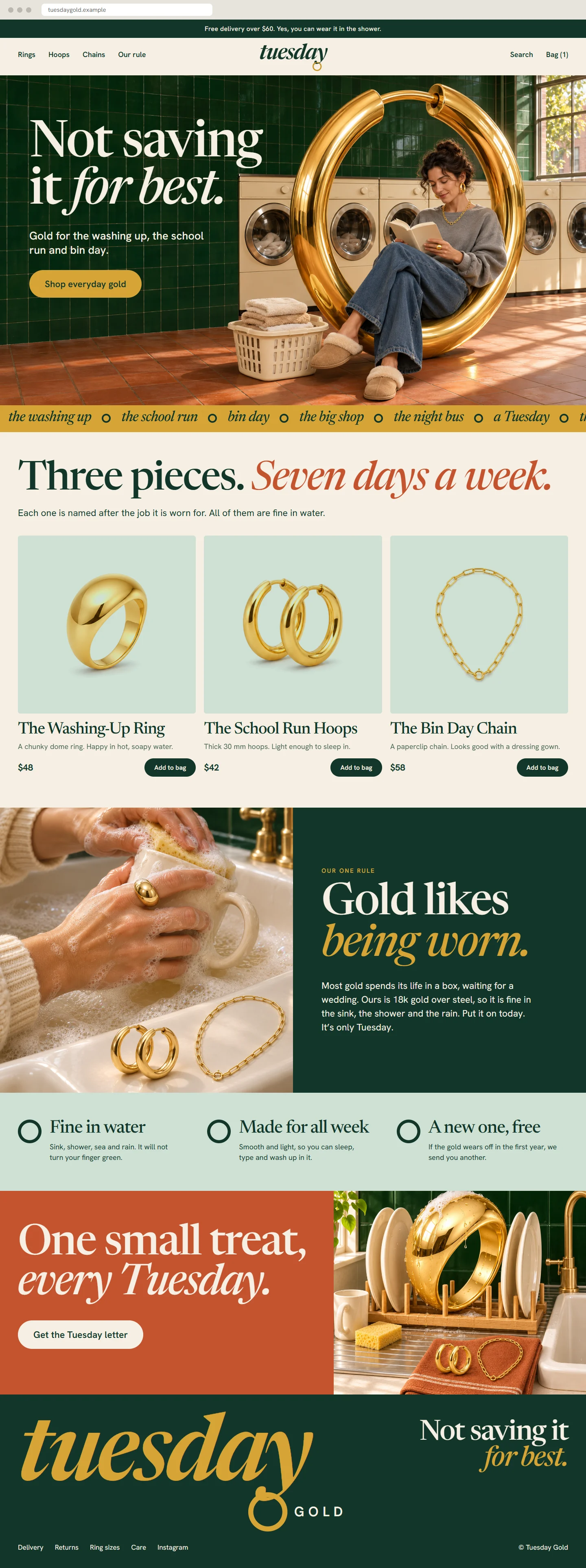
- A home page with its own voice, a campaign banner and three named pieces.
This shop is not real. I made it to show what a full project looks like, and I made the “before” versions too. The name, products, prices and addresses are invented.
The idea
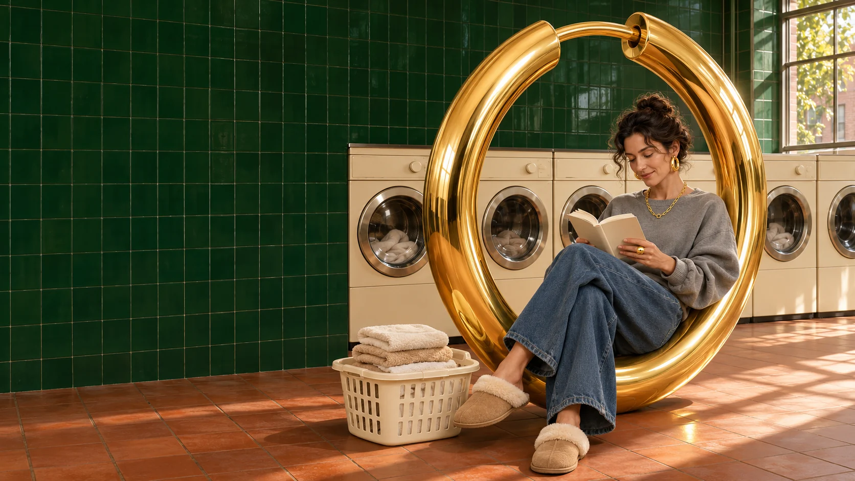
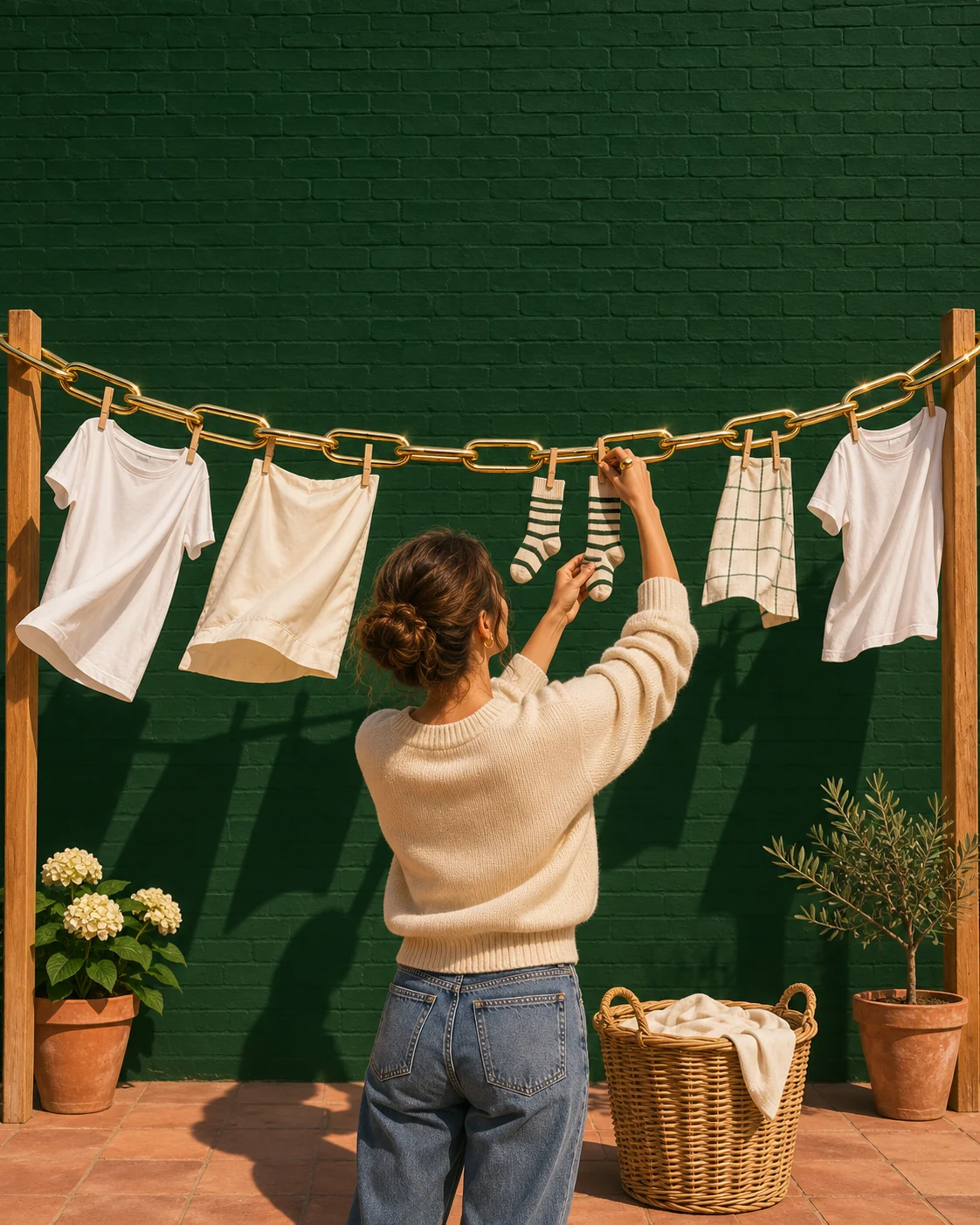
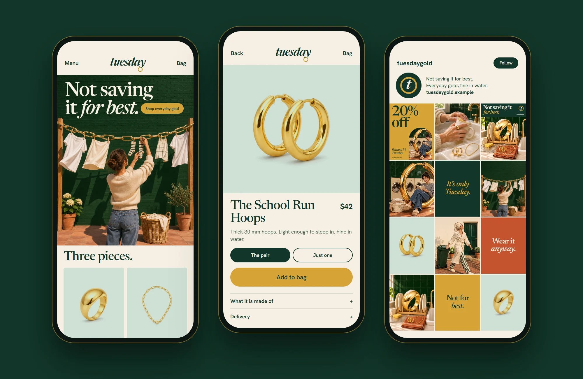
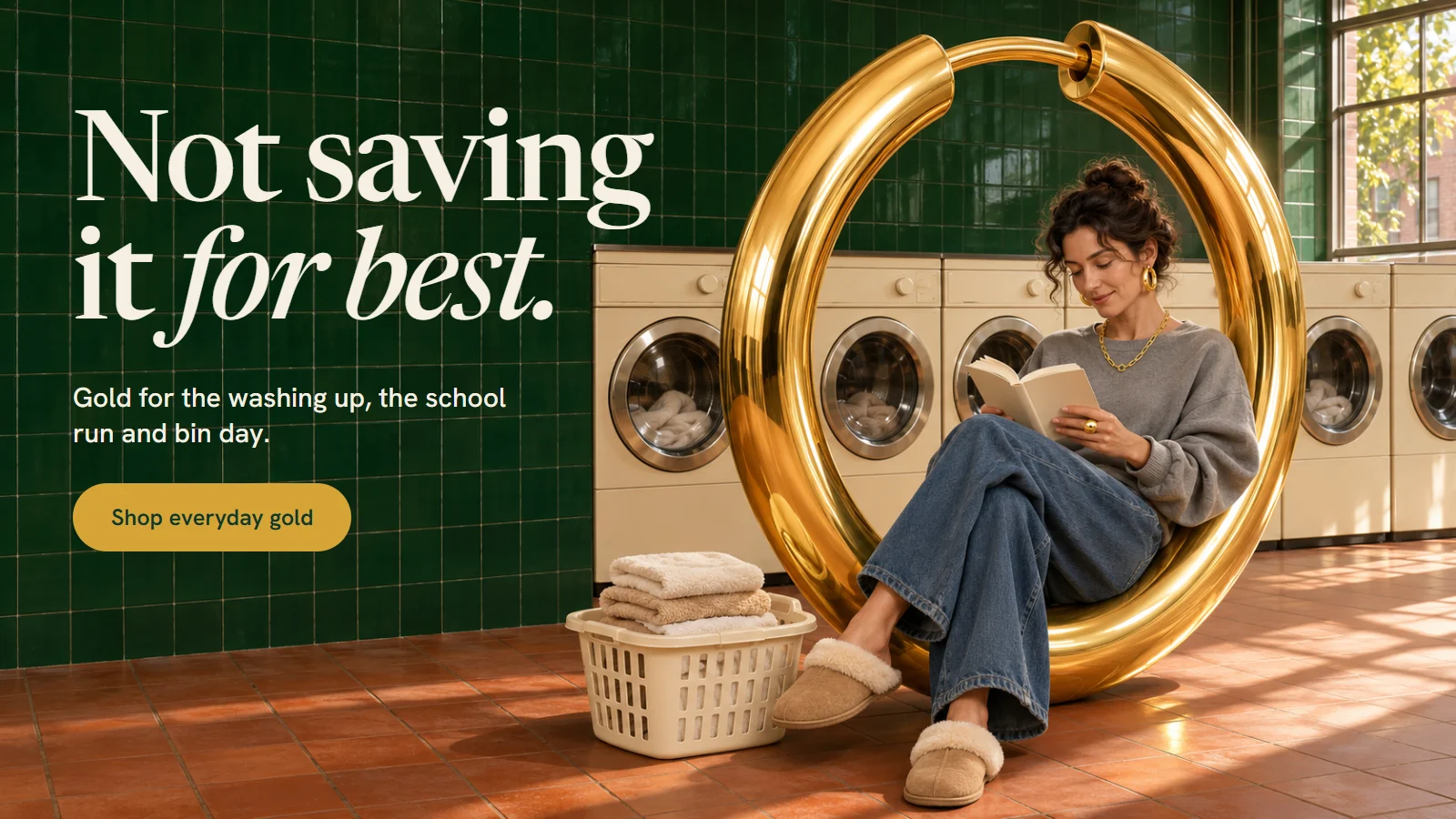
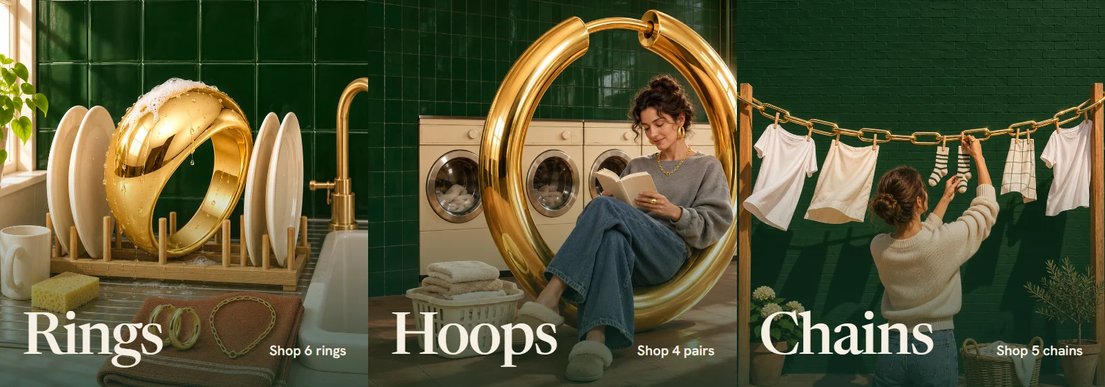
Gold jewellery made to be worn every day, not kept in a box for a wedding. The logo wears a gold hoop on its last letter and never takes it off. In the campaign the gold turns up in very normal places: a giant ring in the plate rack, a chain used as a washing line, and a hoop as big as a chair in the launderette. Warm, a little cheeky, and happy to do the washing up.
- Category
- Jewellery
- Typefaces
- Newsreader, Hanken Grotesk
- Colours
- Bottle, Tuesday Gold, Soap, Suds, Flowerpot
Piece by piece, before and after.
 BeforeAfter
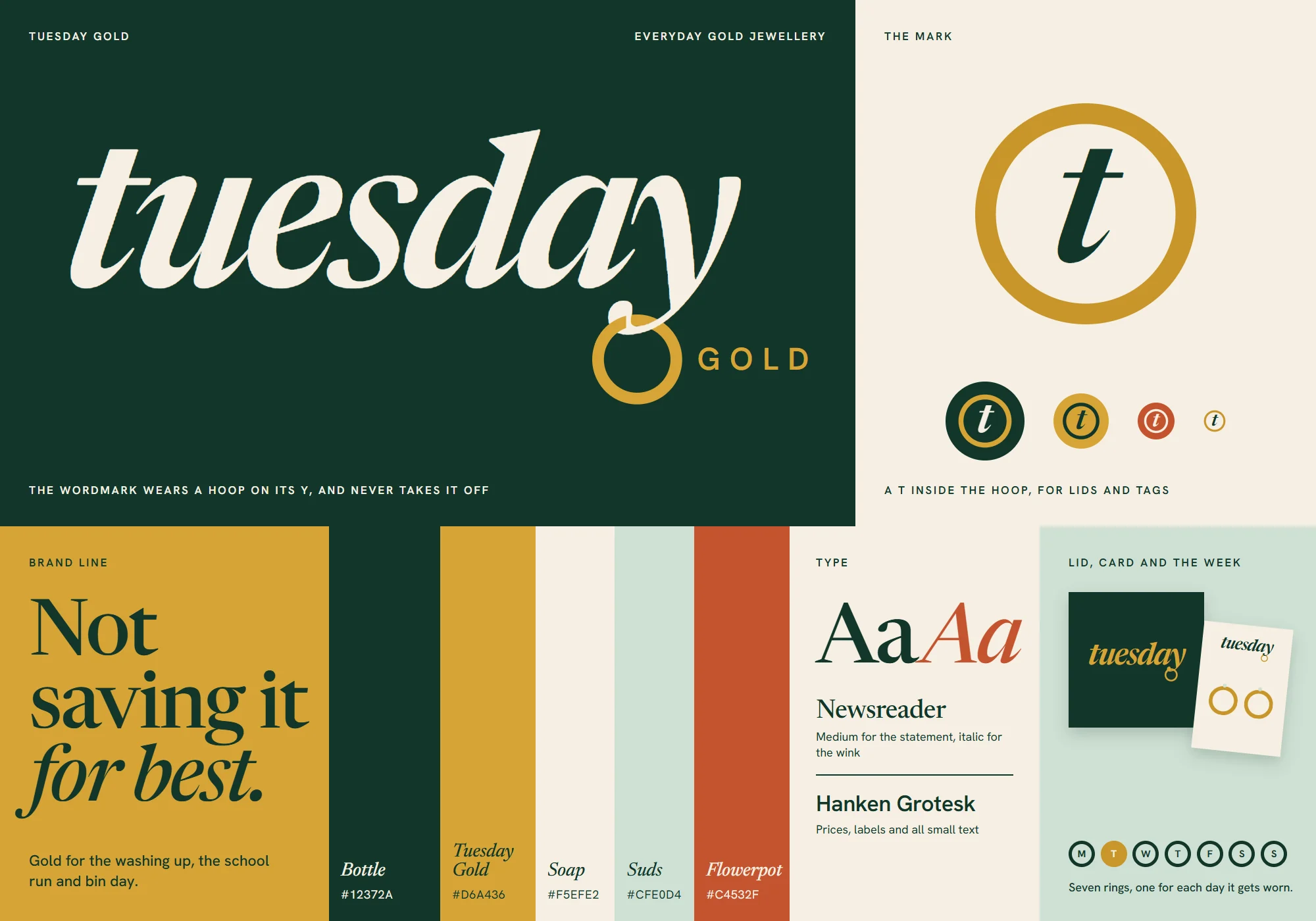
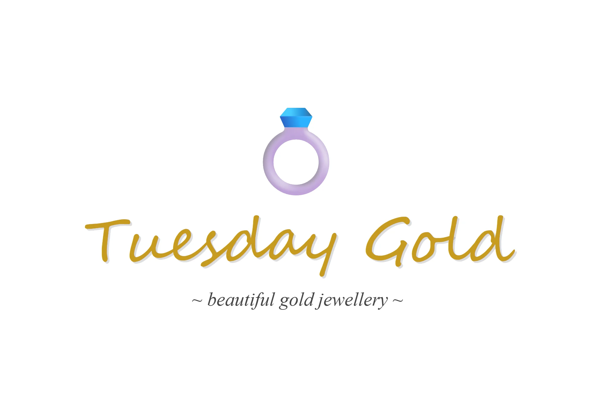
Logo and brand kit
- Before
- The name in a handwriting font, under a ring emoji.
- After
- A wordmark that wears a gold hoop on its y, plus colours and type for everything else.
 BeforeAfter
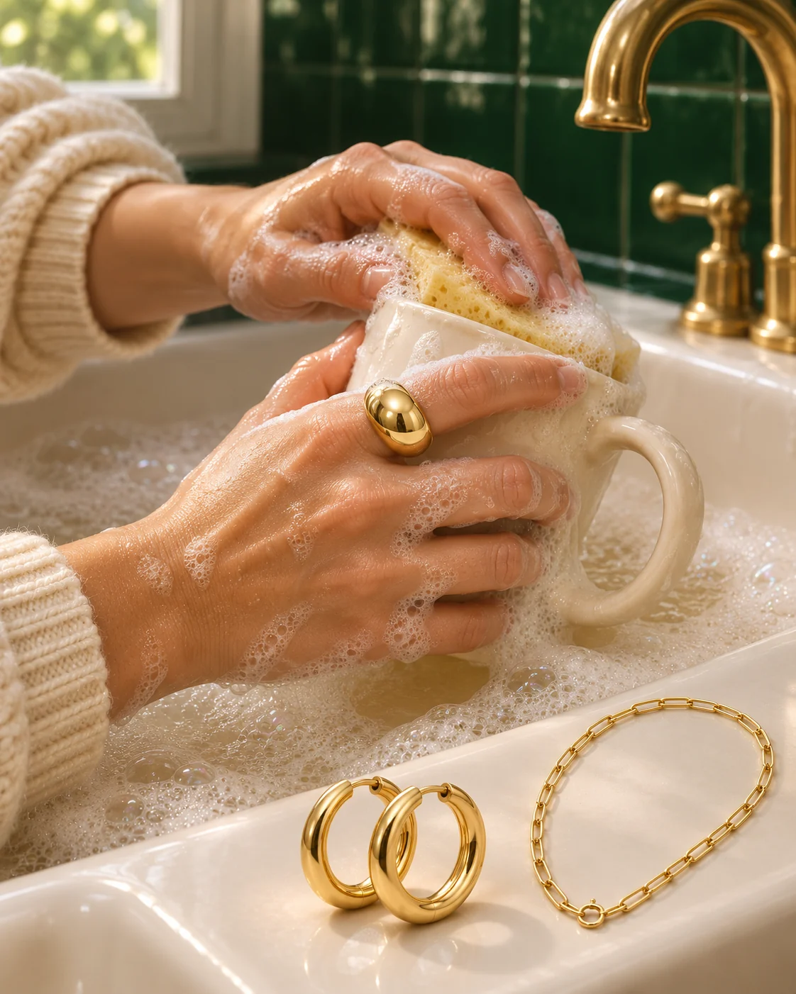
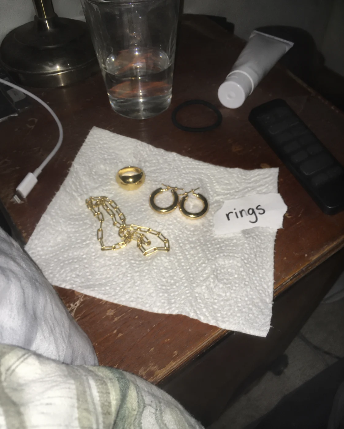
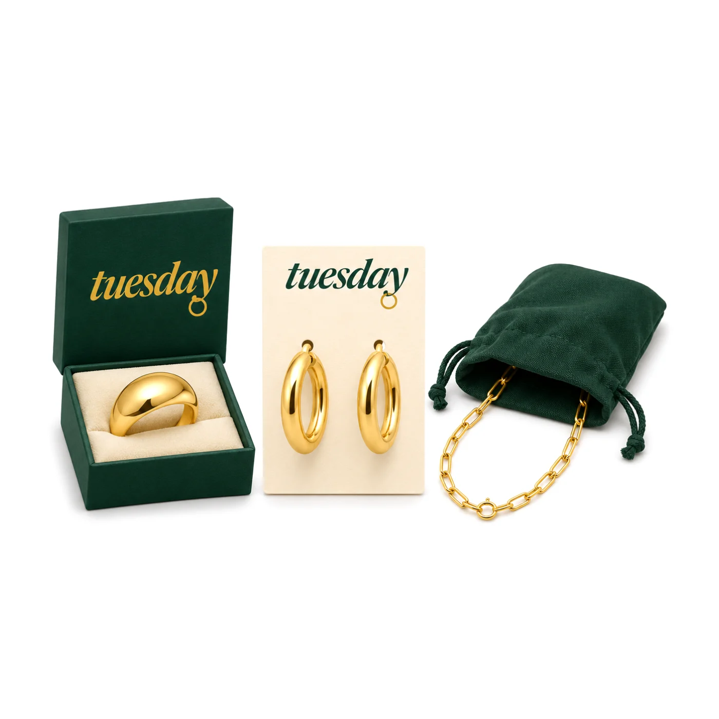
Packaging and product photo
- Before
- A ring, hoops and a chain on kitchen paper, shot with the flash on.
- After
- The same ring at the sink, in daylight, doing the washing up.
 BeforeAfter
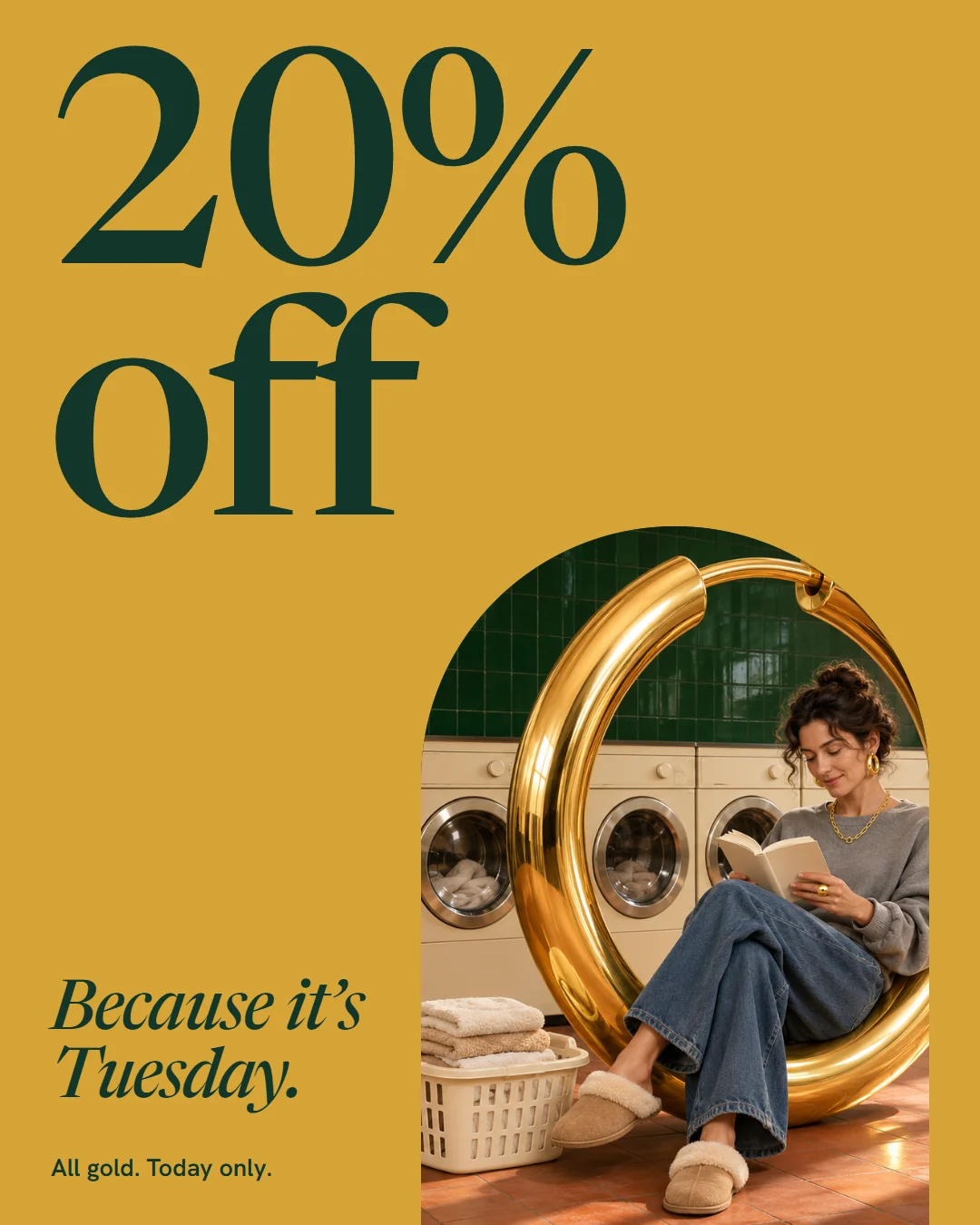
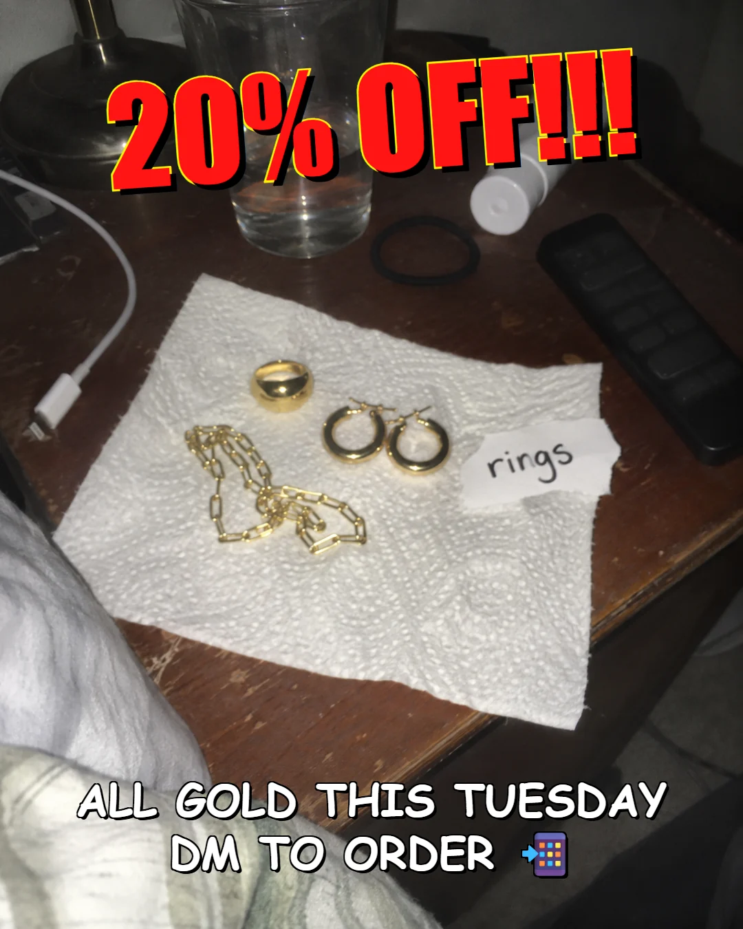
Social post
- Before
- 20% off, shouted in red over the bedside photo.
- After
- The same 20% off, said once, with a reason: it’s Tuesday.
Everything in the project.
Product images
The Shopify store
Banners
Social
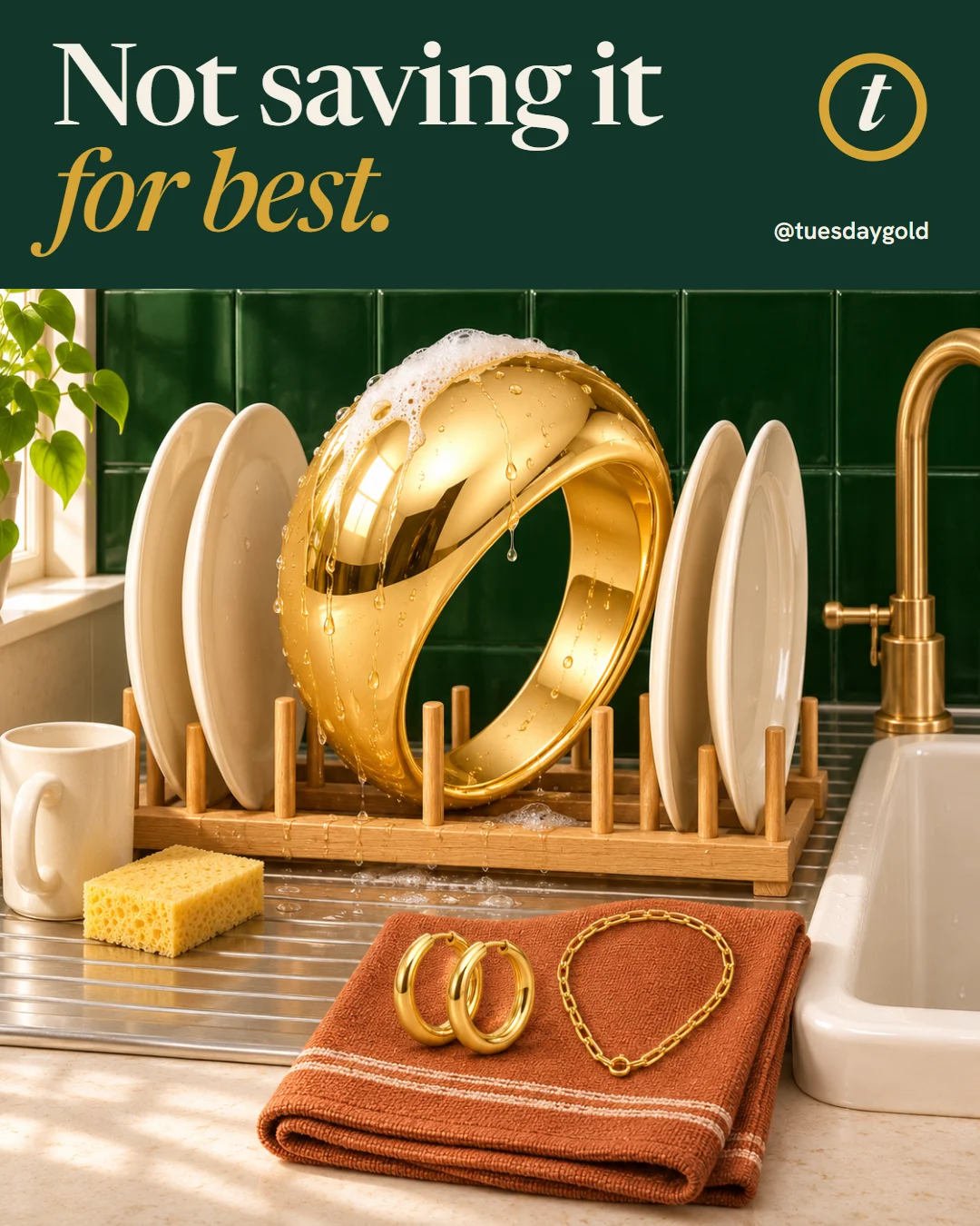
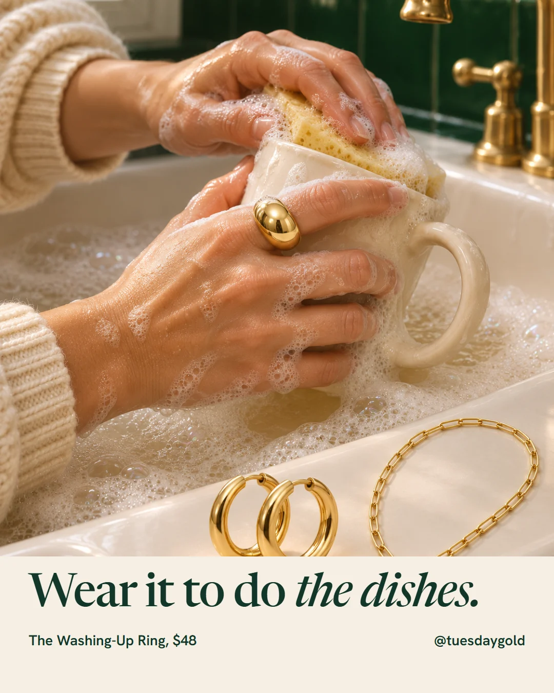
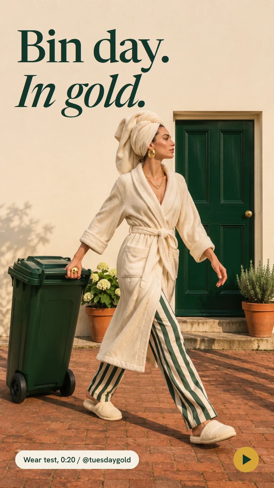
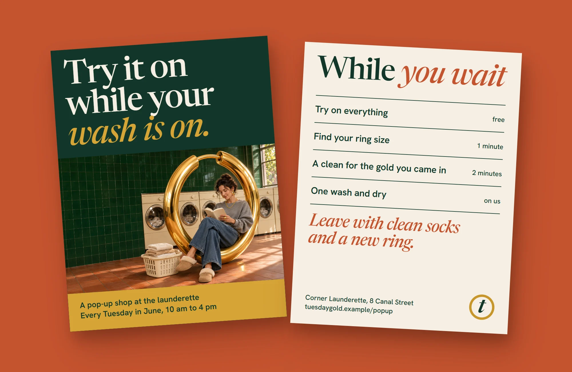
Campaign images