MISPRINT
Perfectly wrong.
Clothing. Logo, packaging, store, banners, social, print
 BeforeAfter
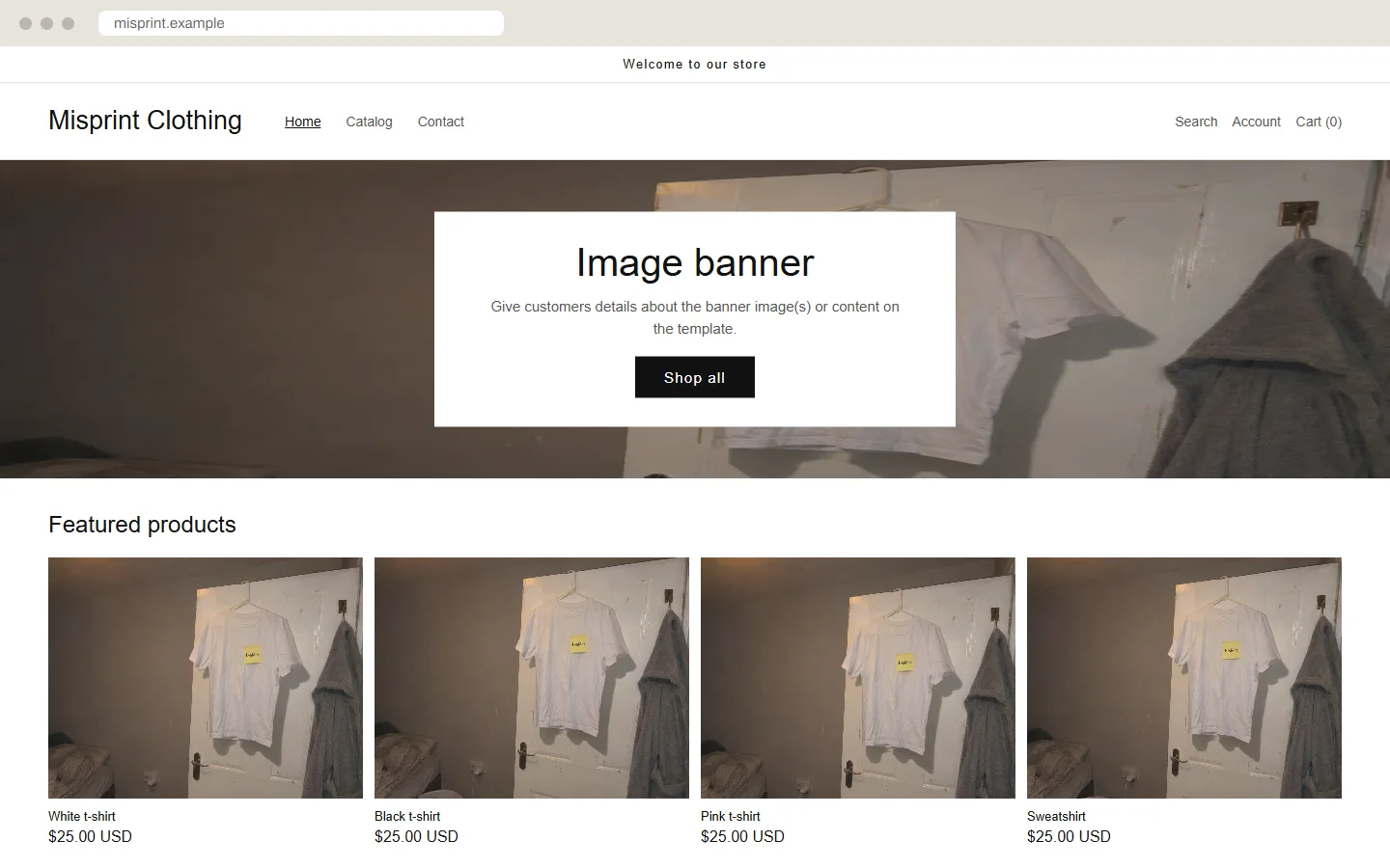
- Before
- A store theme nobody touched, with one bedroom photo used four times.
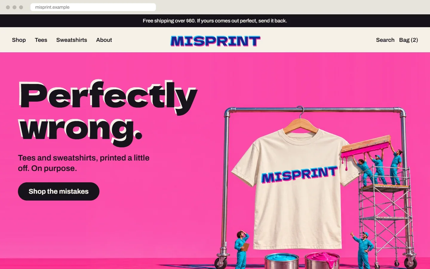
- After
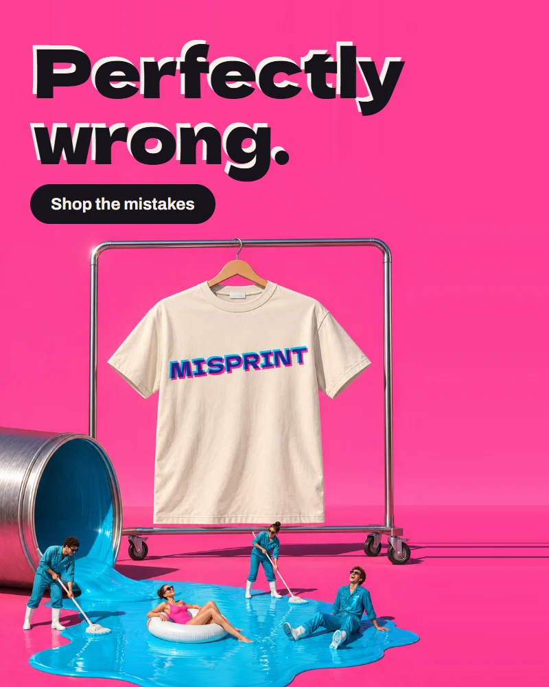
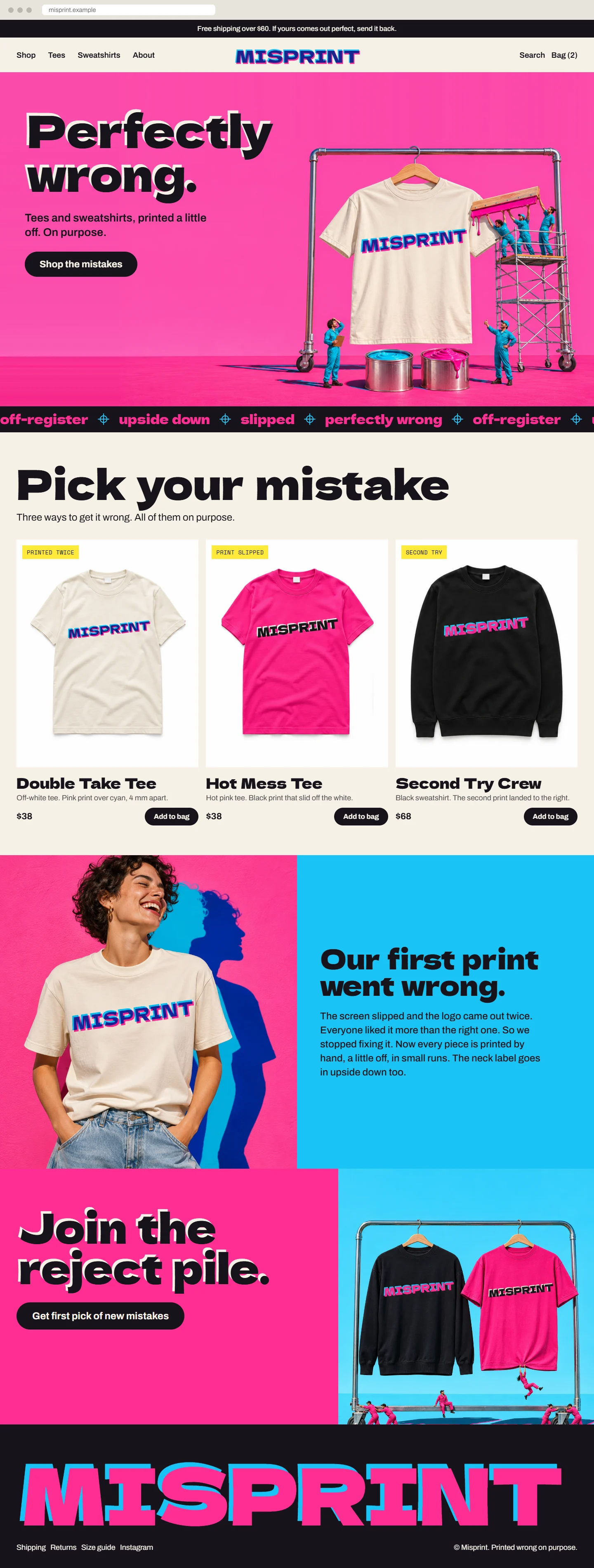
- A loud pink home page with one clear line: Perfectly wrong.
This shop is not real. I made it to show what a full project looks like, and I made the “before” versions too. The name, products, prices and addresses are invented.
The idea
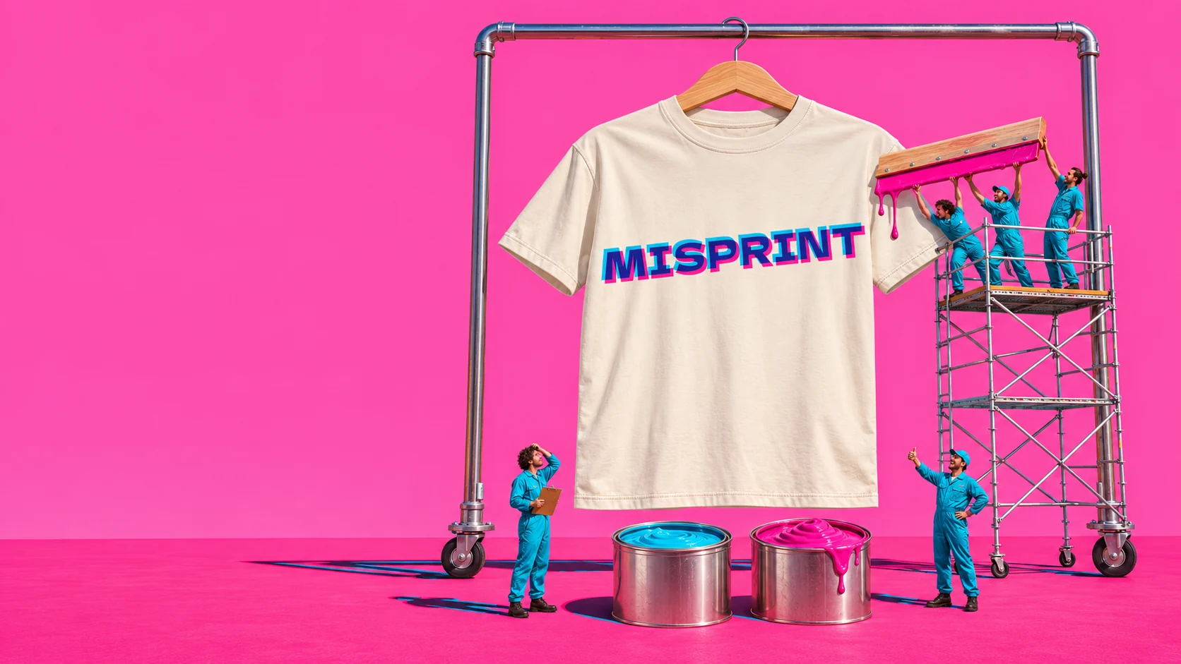
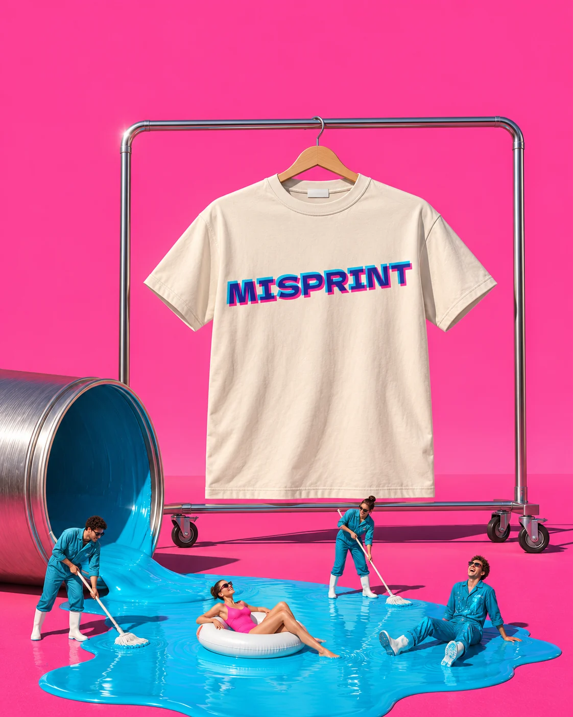
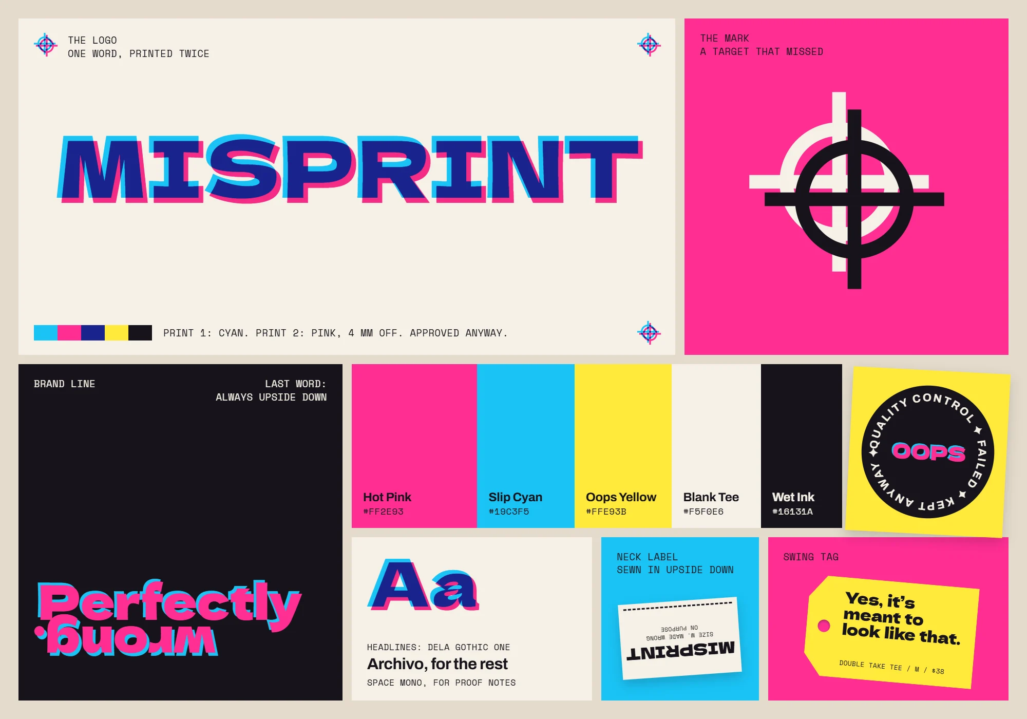
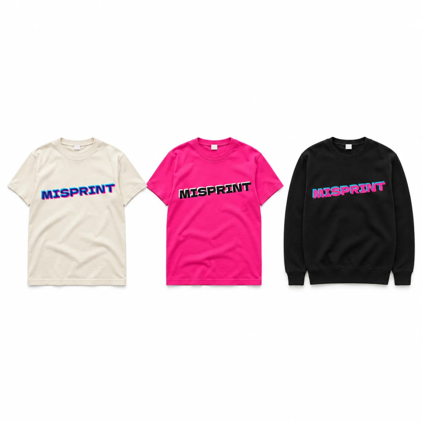
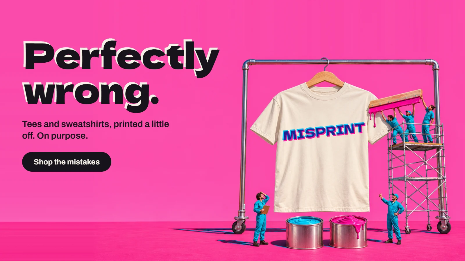
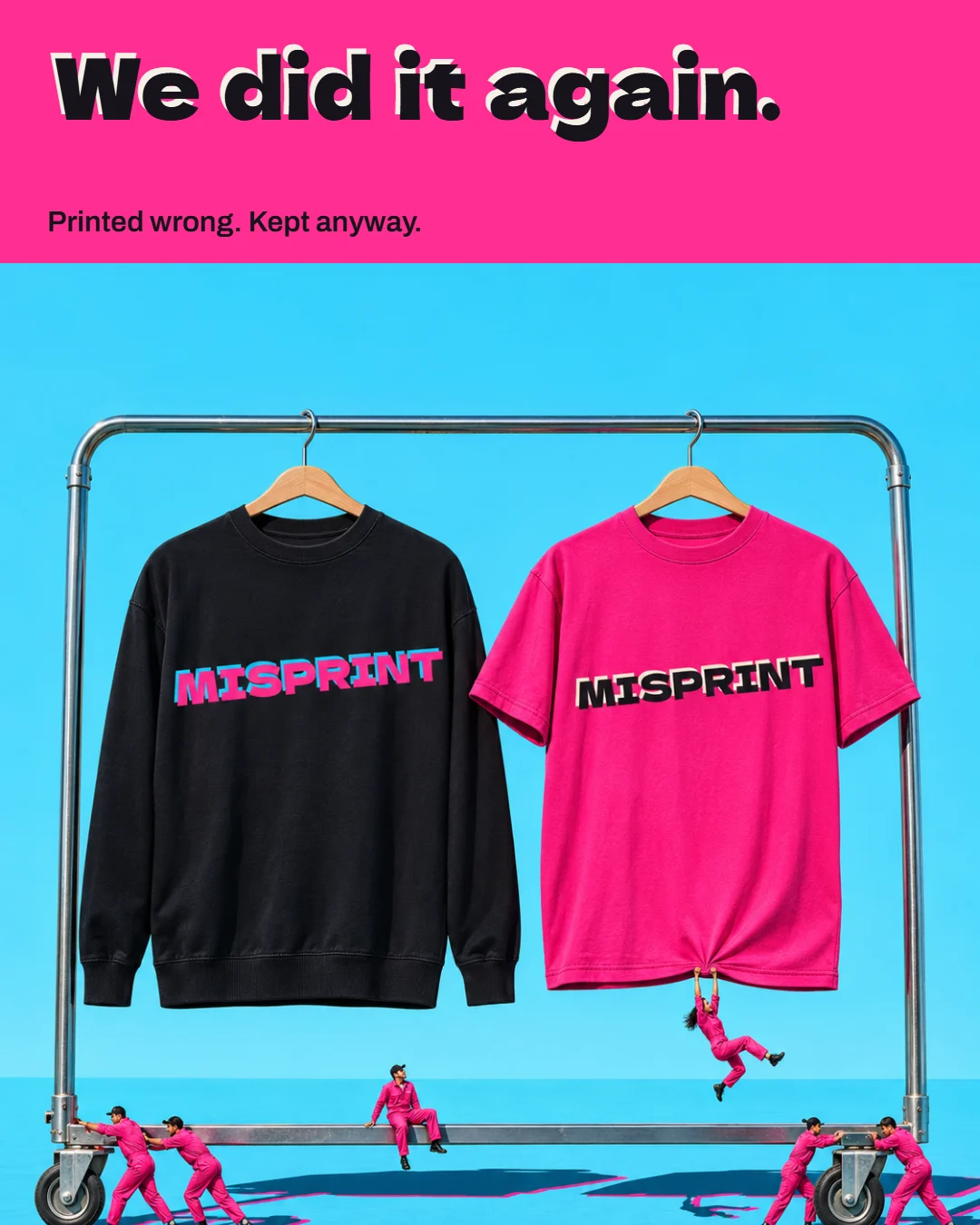
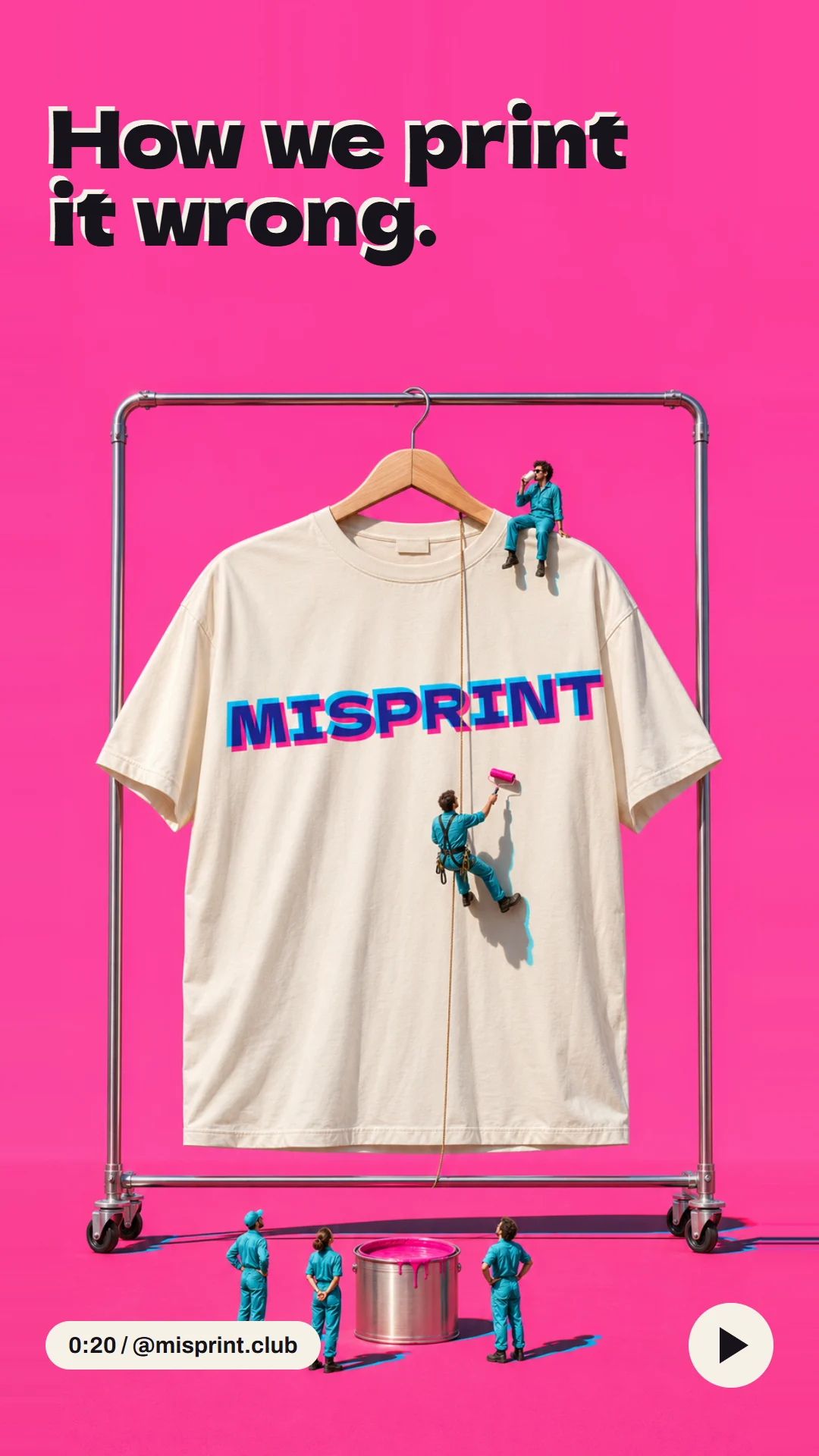
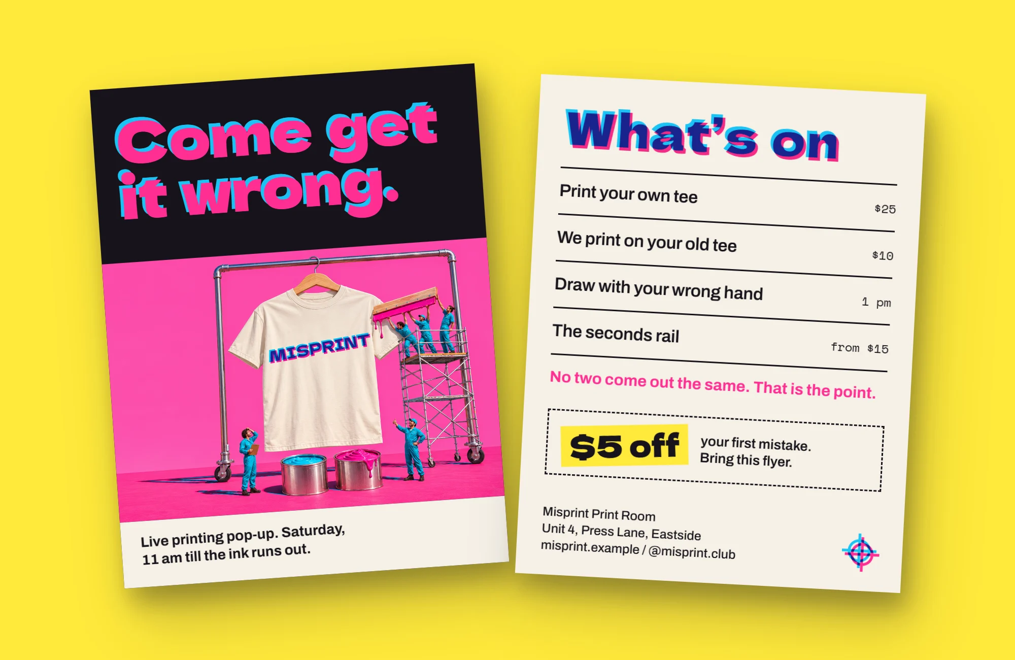
Tees and sweatshirts that are printed a little wrong, on purpose. The logo is the name printed twice, in pink and cyan, a few millimetres apart, and the neck label goes in upside down. In the campaign a tiny print crew works on a T-shirt as big as a building, and still gets it wrong. Loud, funny and very sure of itself.
- Category
- Clothing
- Typefaces
- Dela Gothic One, Archivo, Space Mono
- Colours
- Hot Pink, Slip Cyan, Oops Yellow, Blank Tee, Wet Ink
Piece by piece, before and after.
 BeforeAfter
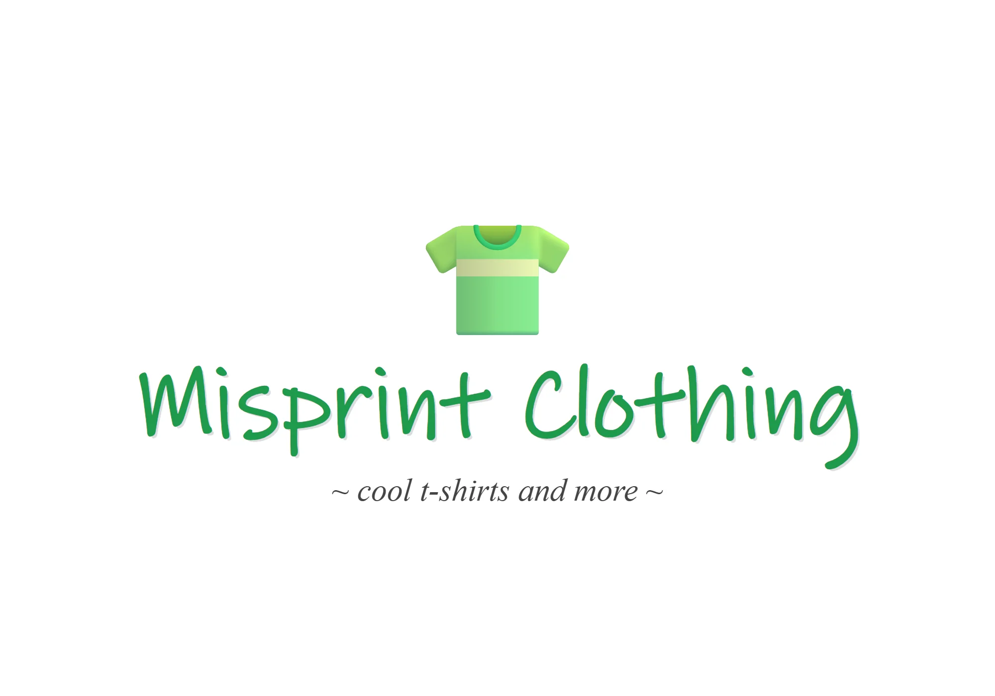
Logo and brand kit
- Before
- The name in a handwriting font, under a T-shirt emoji.
- After
- The name printed twice, a little apart, plus colours, type, a label and a tag.
 BeforeAfter
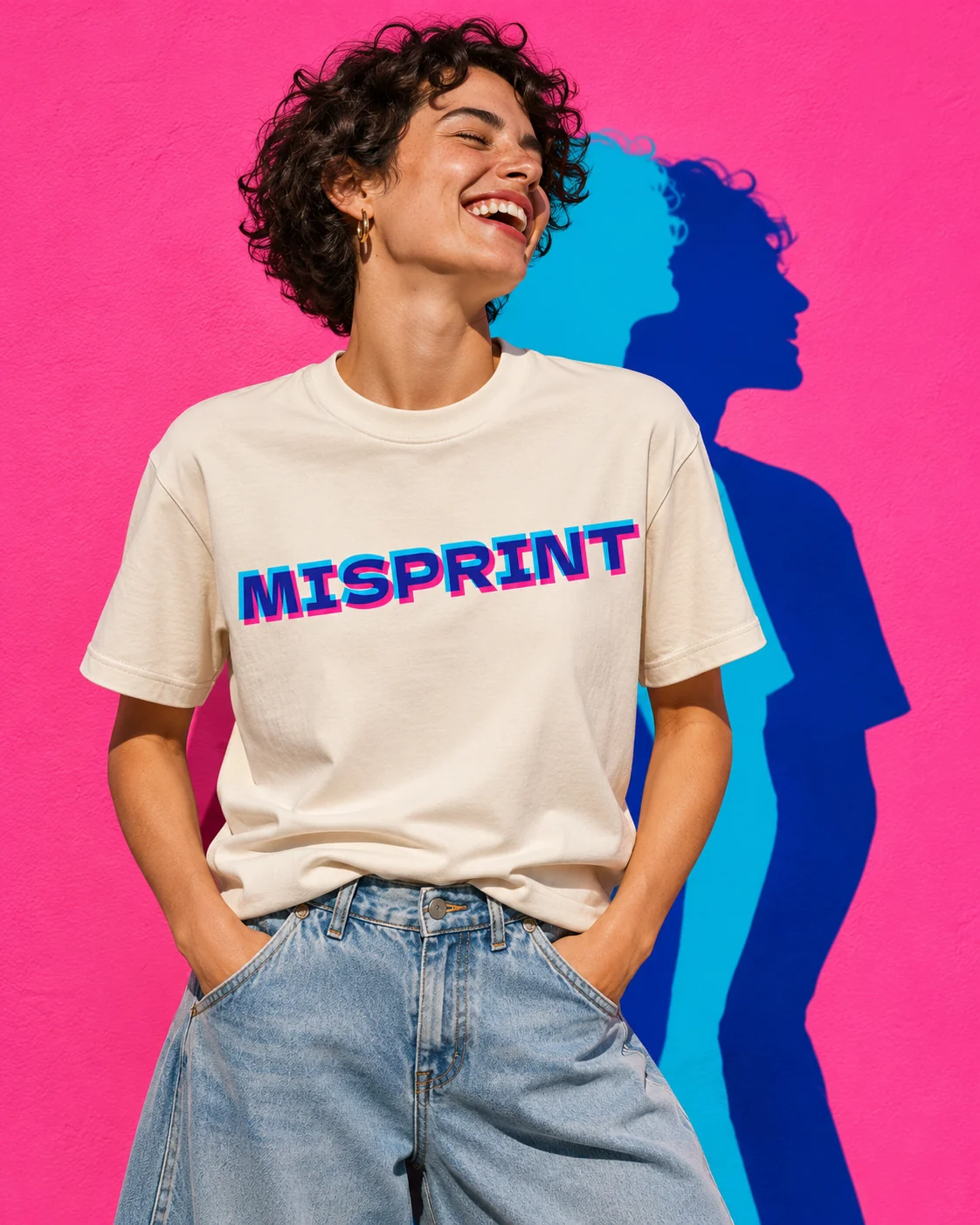
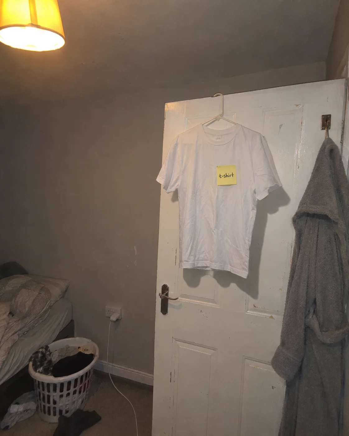
Packaging and product photo
- Before
- A plain white tee on a bedroom door, with a sticky note, shot with the flash on.
- After
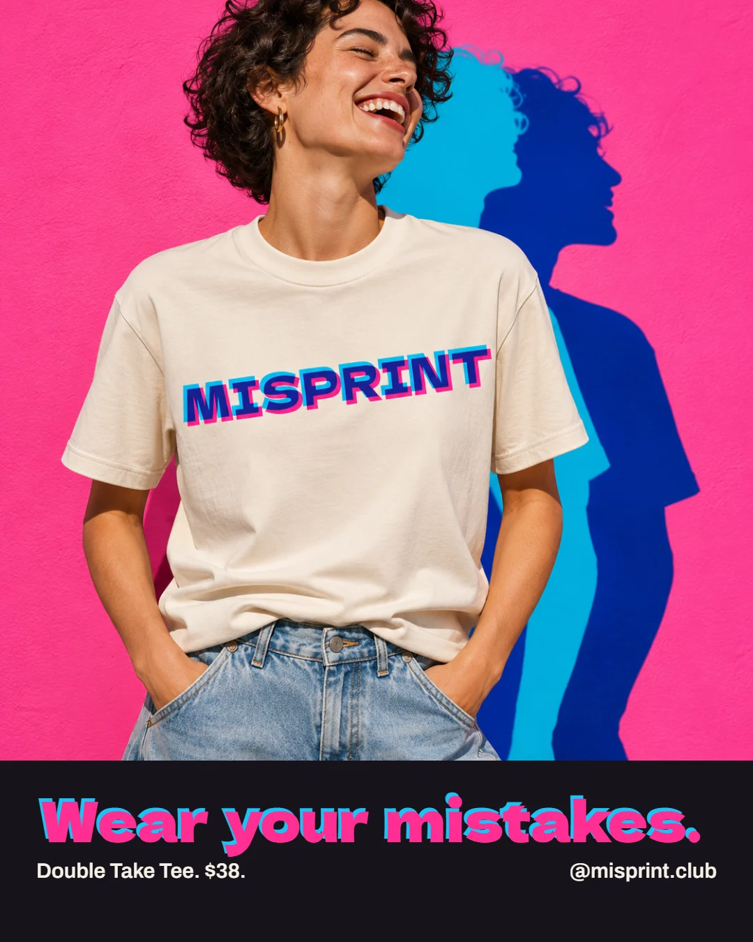
- A printed tee on a model, in hard sun, against a pink wall.
 BeforeAfter
Social post
- Before
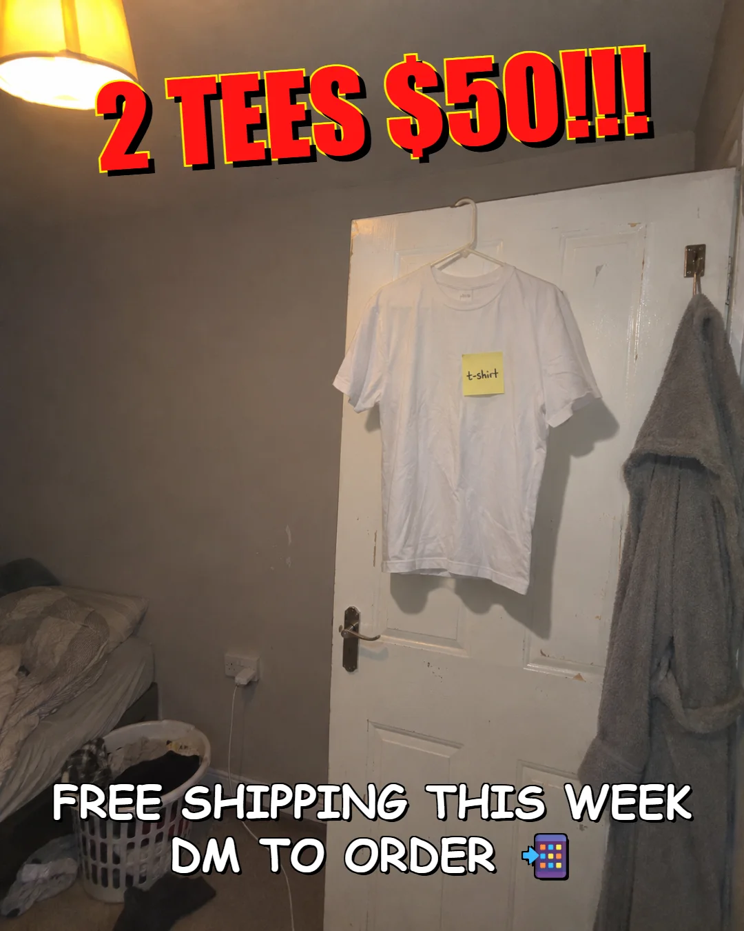
- 2 tees for $50, shouted in red over the bedroom photo.
- After
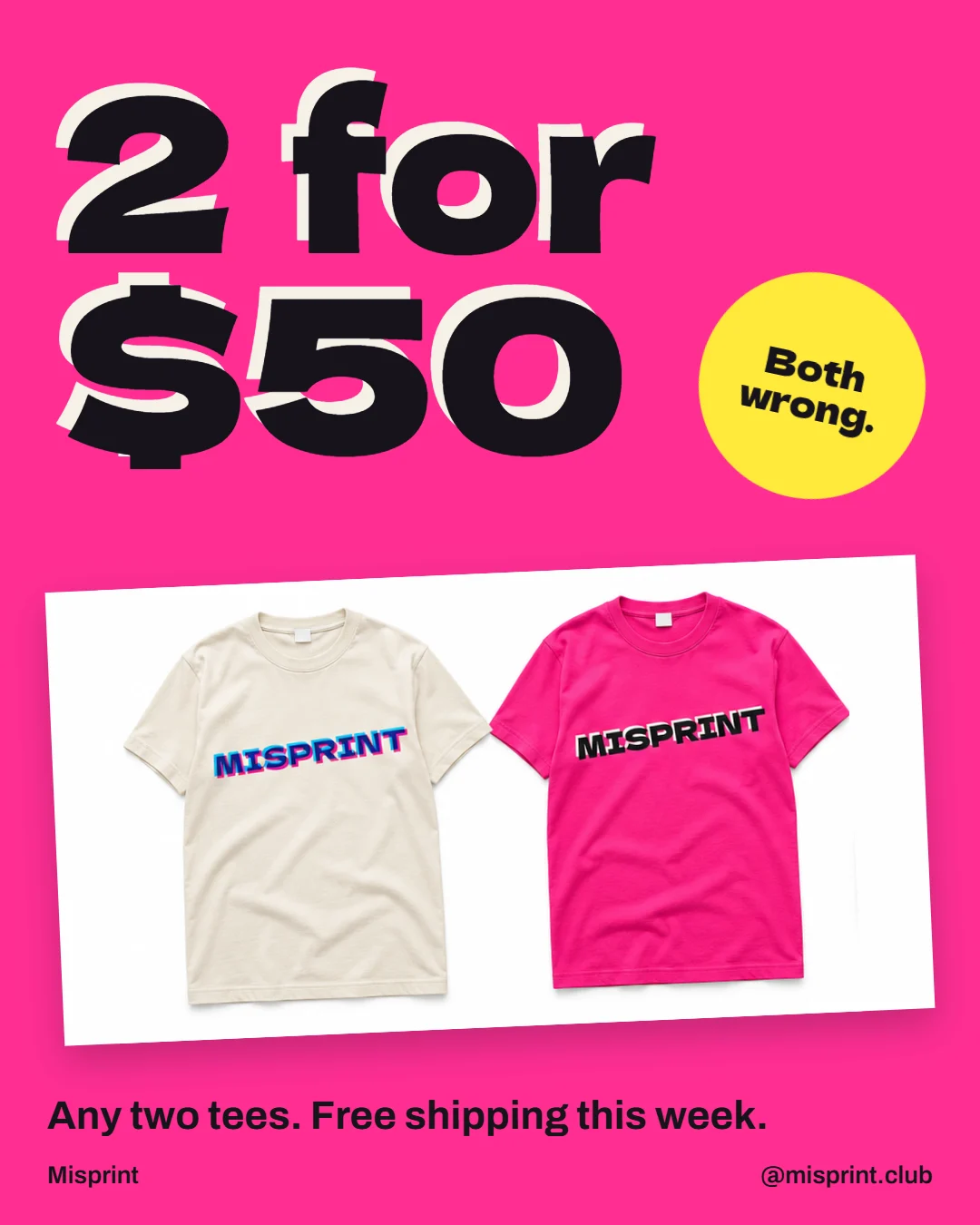
- The same offer, with both tees and one big price.
Everything in the project.
Product images
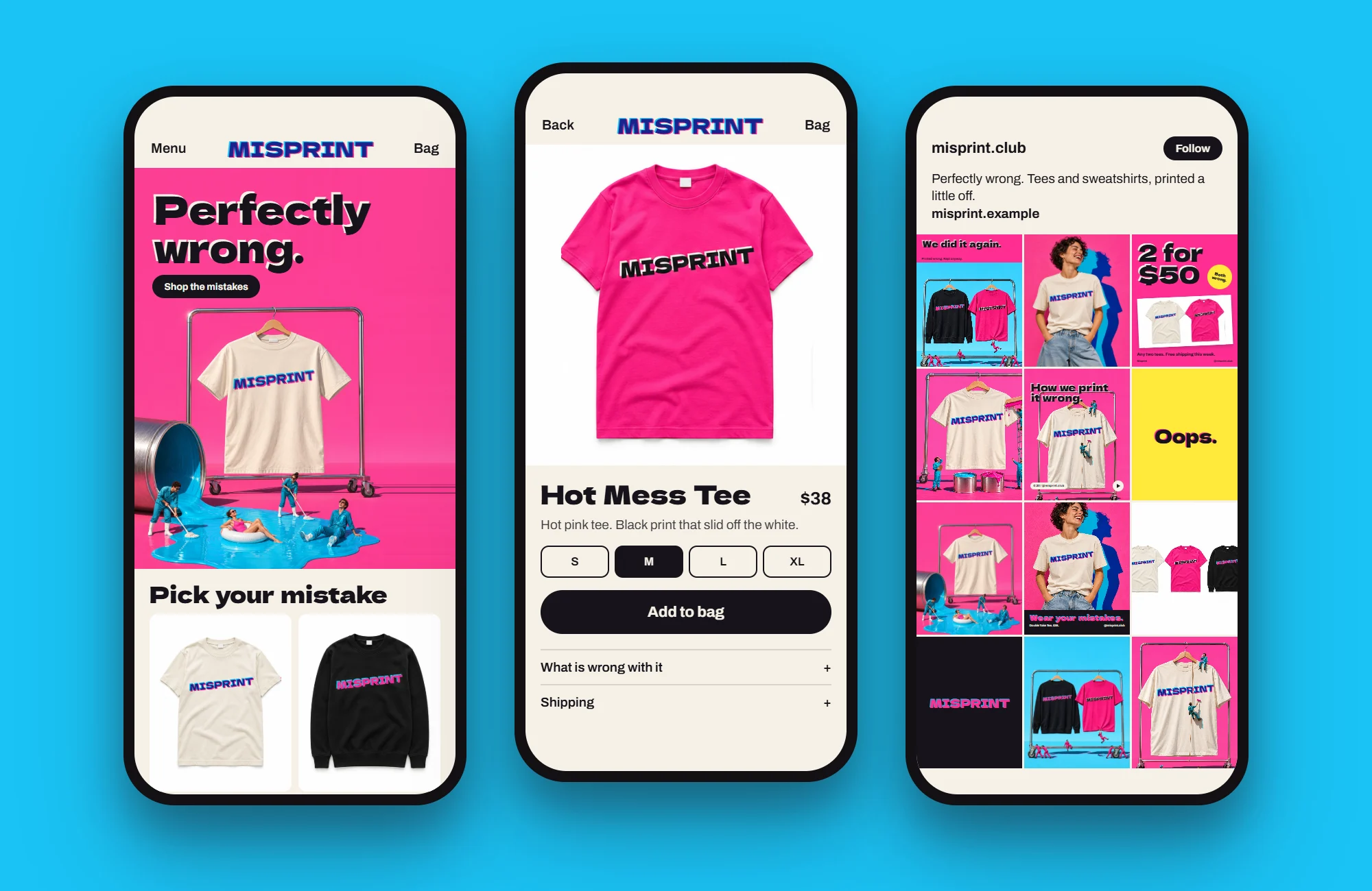
The Shopify store
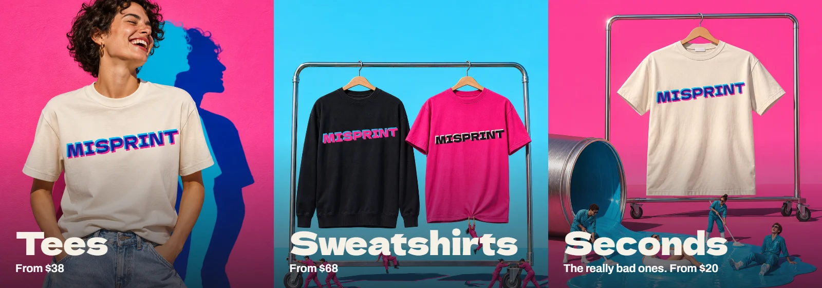
Banners
Social
Campaign images