froth
Calm, with a kick.
Matcha. Logo, packaging, store, banners, social, print
 BeforeAfter
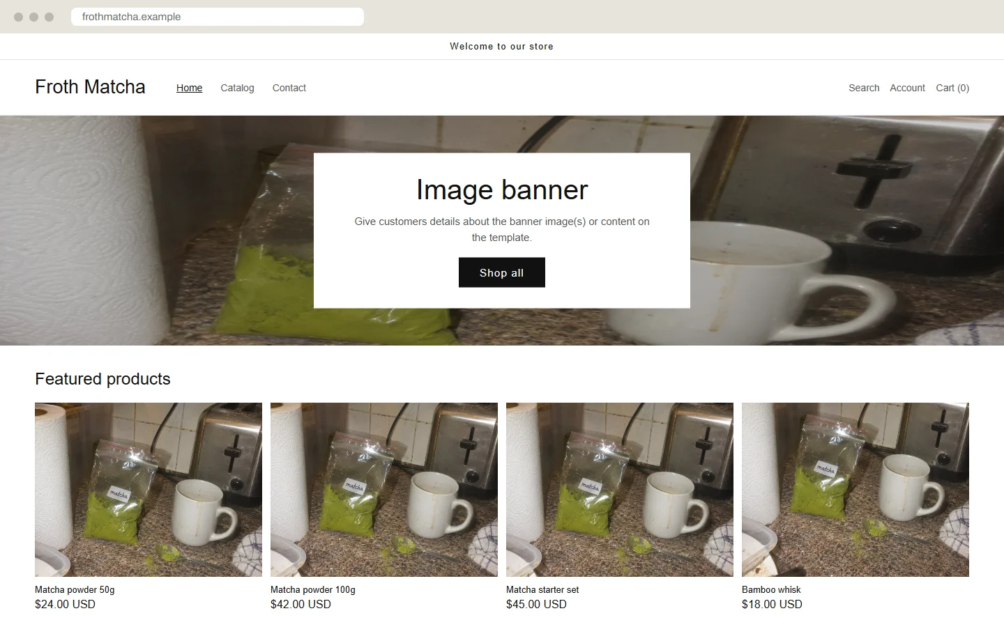
- Before
- A store theme nobody touched, with one kitchen photo used five times.
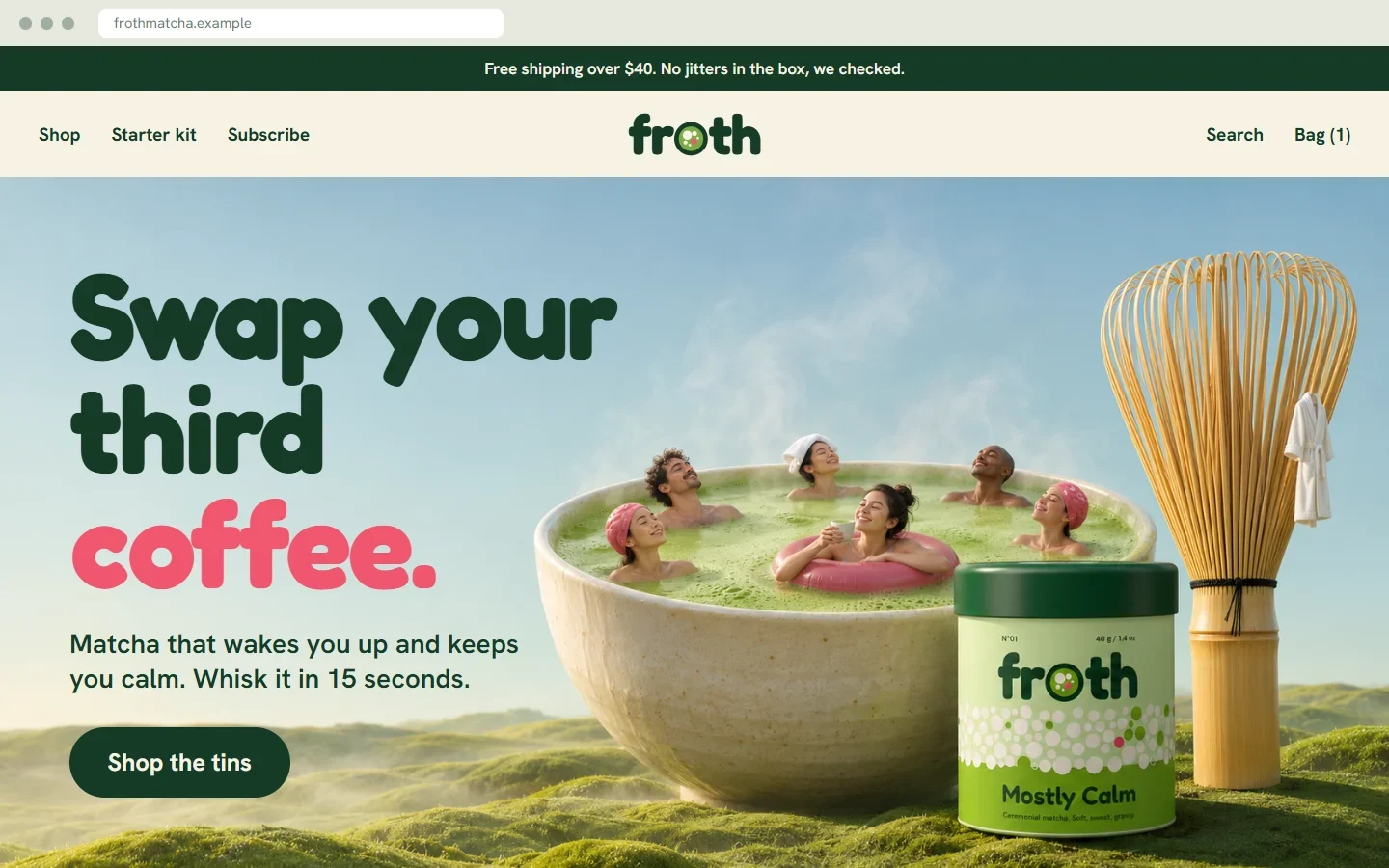
- After
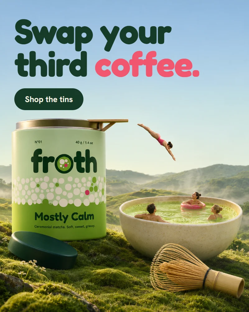
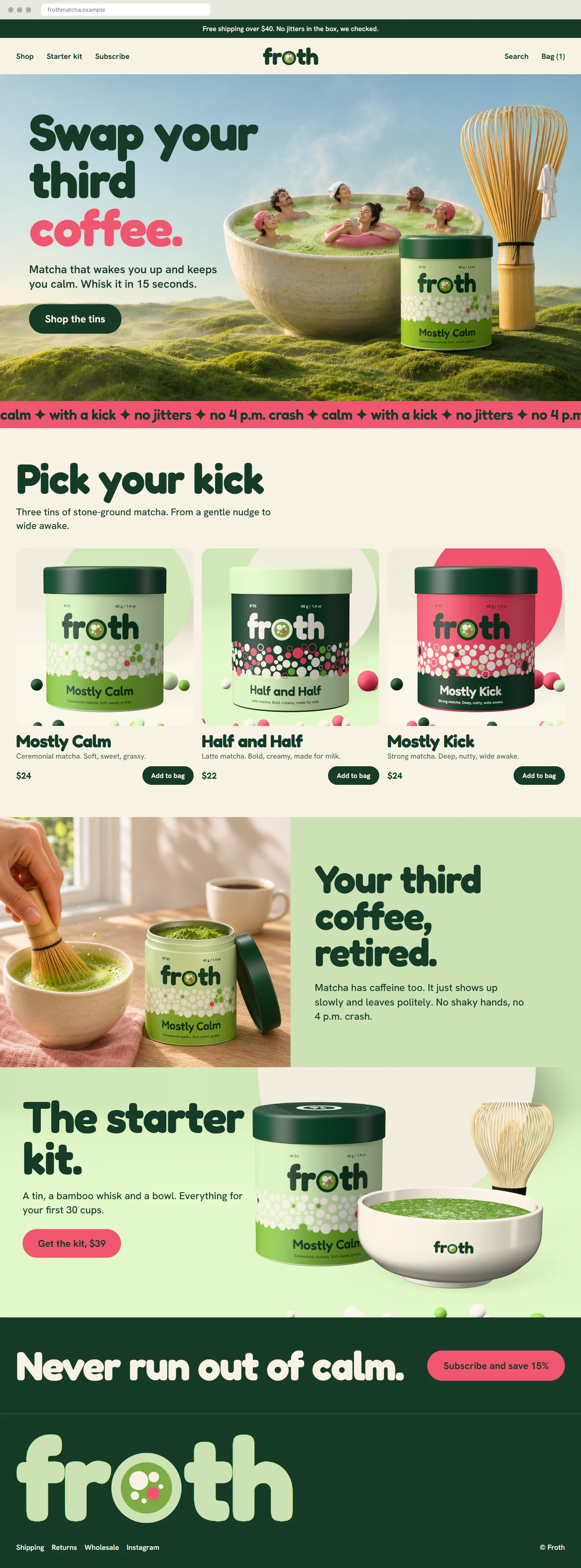
- A light green home page with one clear line: Swap your third coffee.
This shop is not real. I made it to show what a full project looks like, and I made the “before” versions too. The name, products, prices and addresses are invented.
The idea
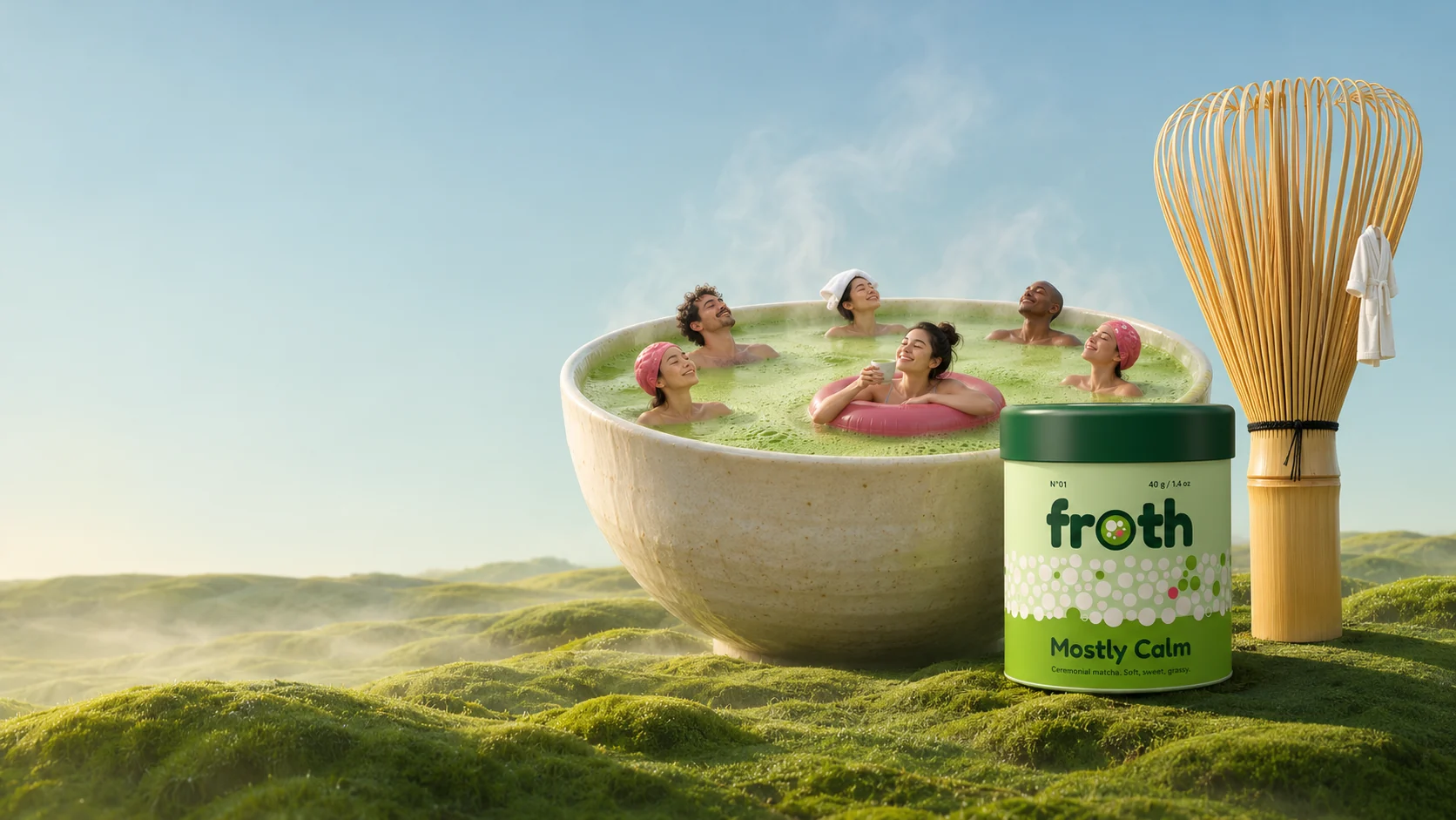
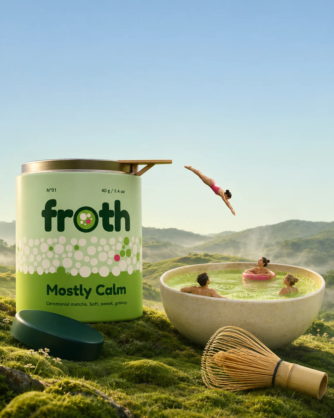
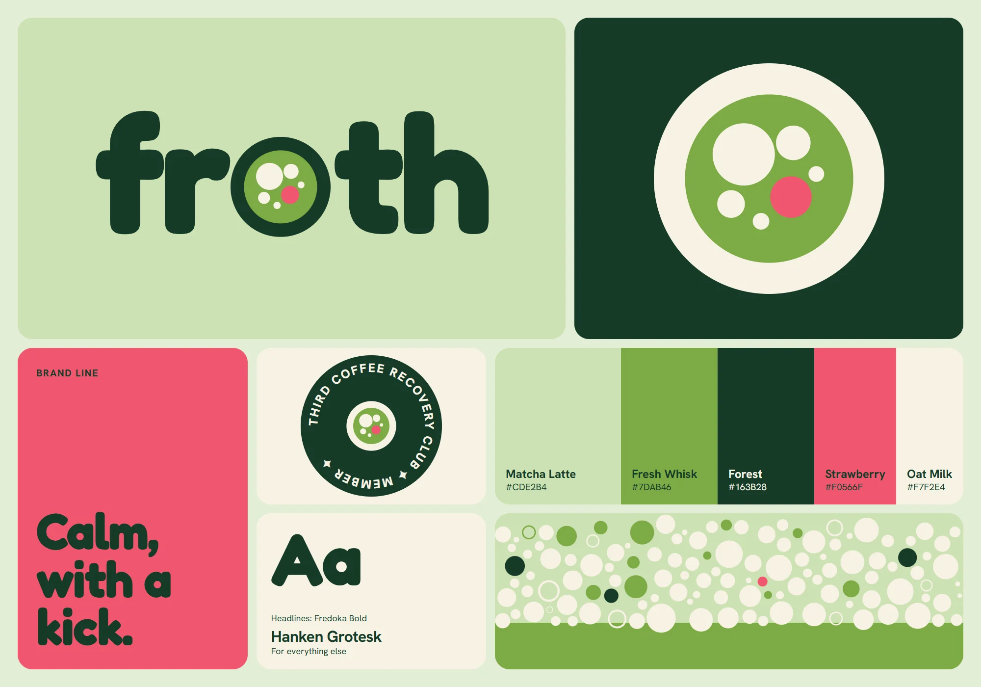
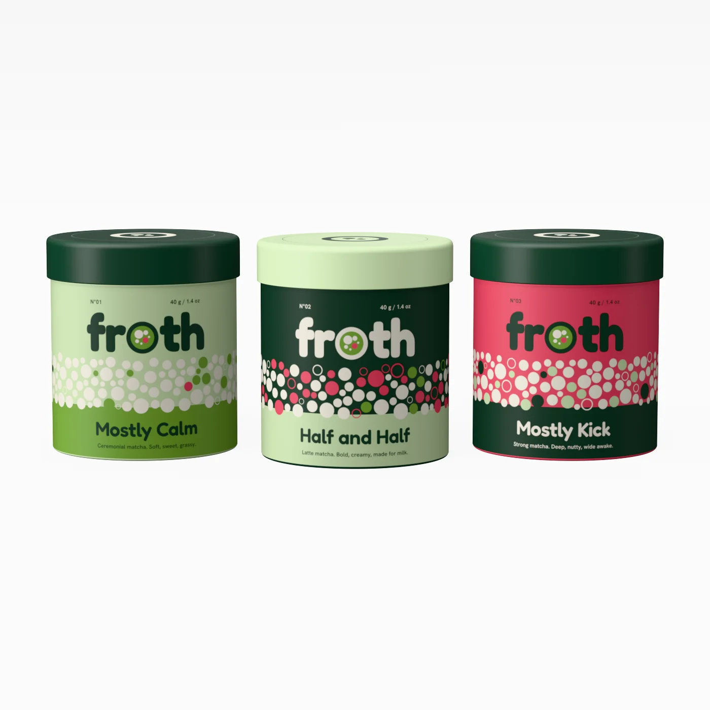
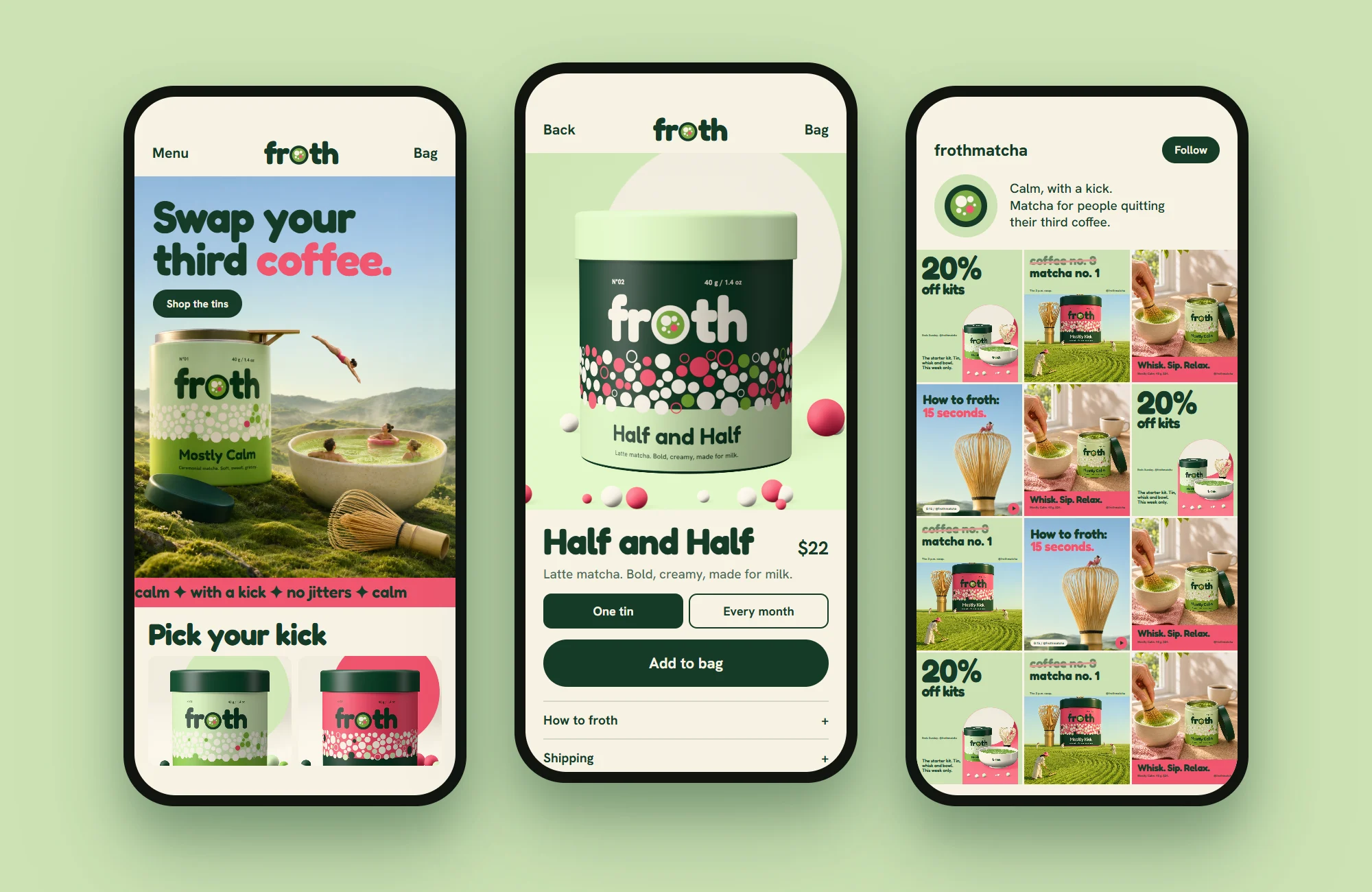
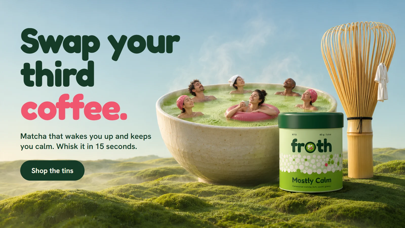
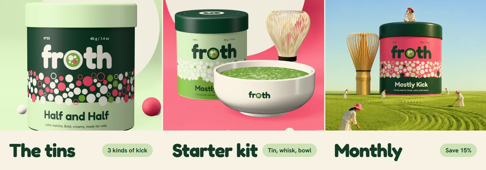
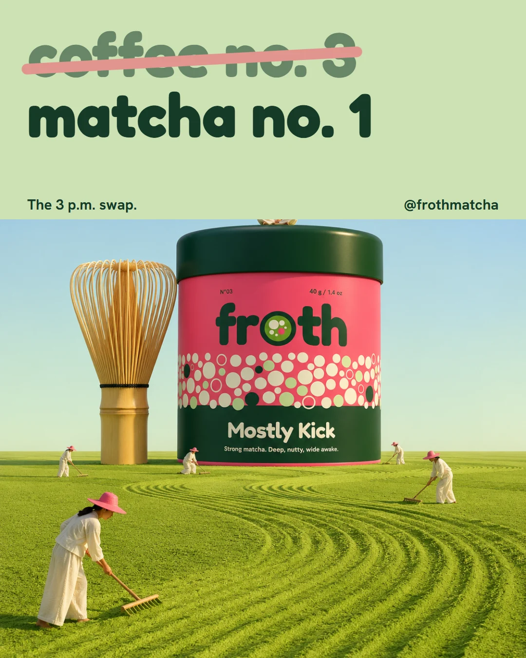
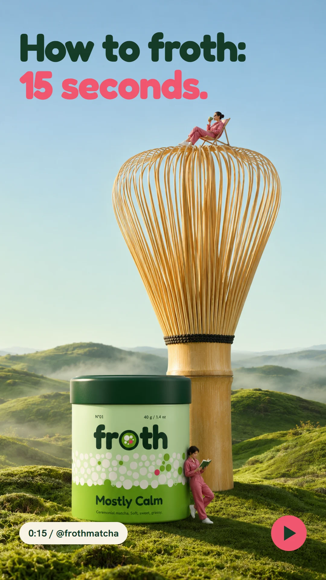
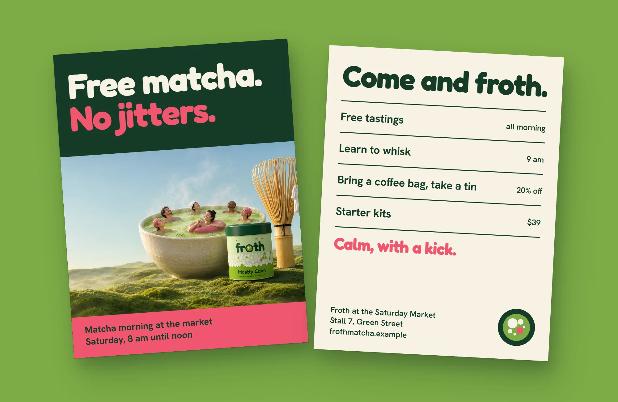
Matcha for people who are trying to quit their third coffee. There are three tins of matcha and a starter kit with a tin, a bamboo whisk and a bowl. The logo has soft, round letters, and the o is a bowl of matcha seen from above, with froth on top. In the campaign, a giant matcha bowl is a hot spring for tiny people, next to a huge whisk, in soft morning light. Friendly, light and a little funny.
- Category
- Matcha
- Typefaces
- Fredoka, Hanken Grotesk
- Colours
- Matcha Latte, Fresh Whisk, Forest, Strawberry, Oat Milk
Piece by piece, before and after.
 BeforeAfter
Logo and brand kit
- Before
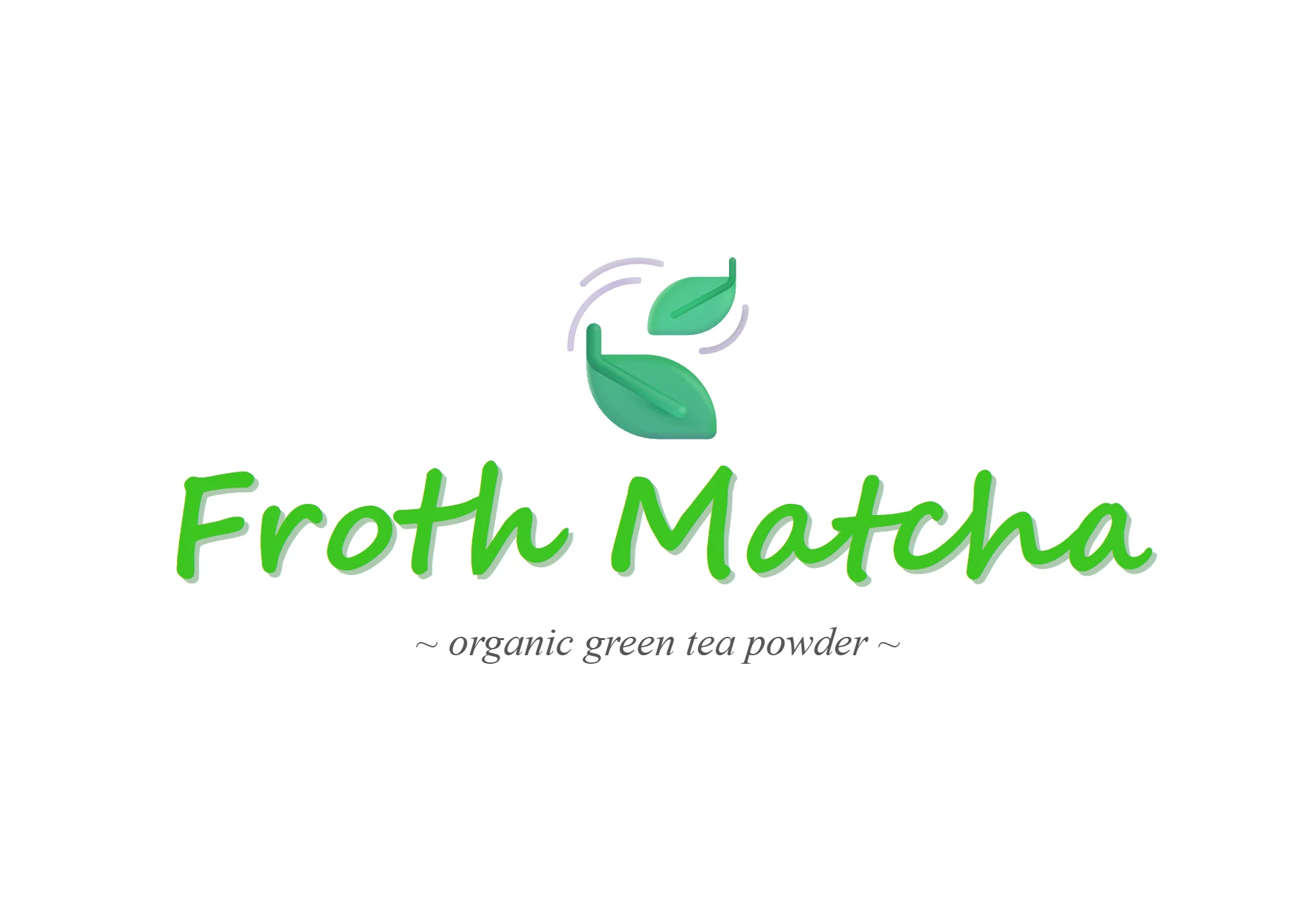
- The name in a handwriting font, under a leaf emoji.
- After
- Soft, round letters with a bowl of froth for the o, plus colours, type and a badge.
 BeforeAfter
Packaging and product photo
- Before
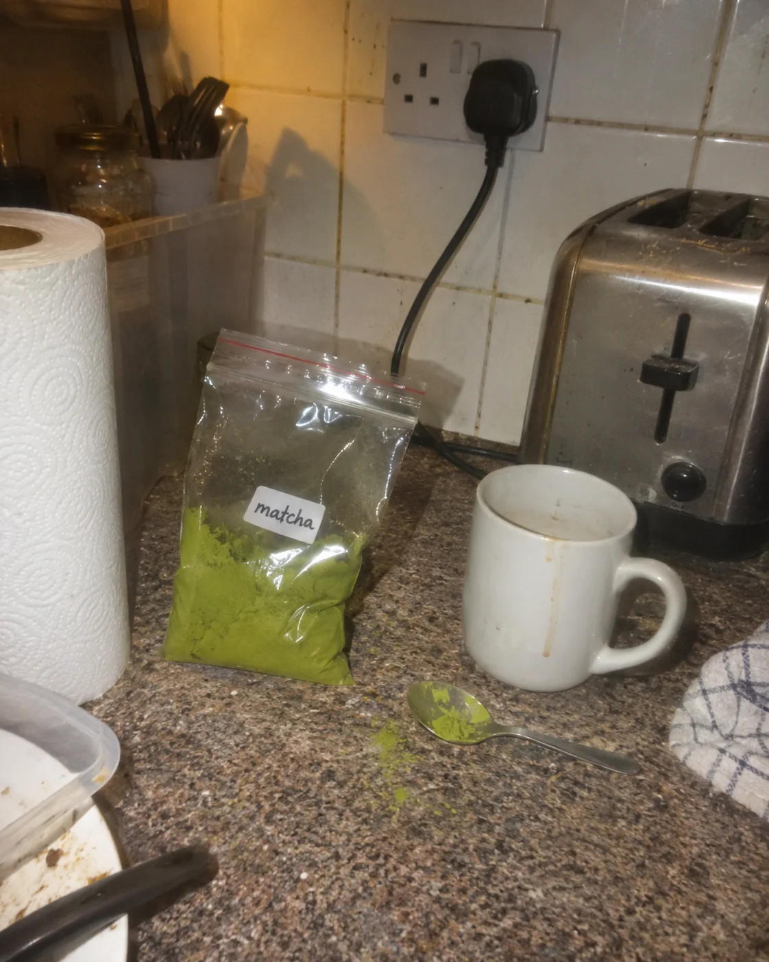
- A zip bag of green powder with a handwritten sticker, next to a used mug, shot with the flash on.
- After
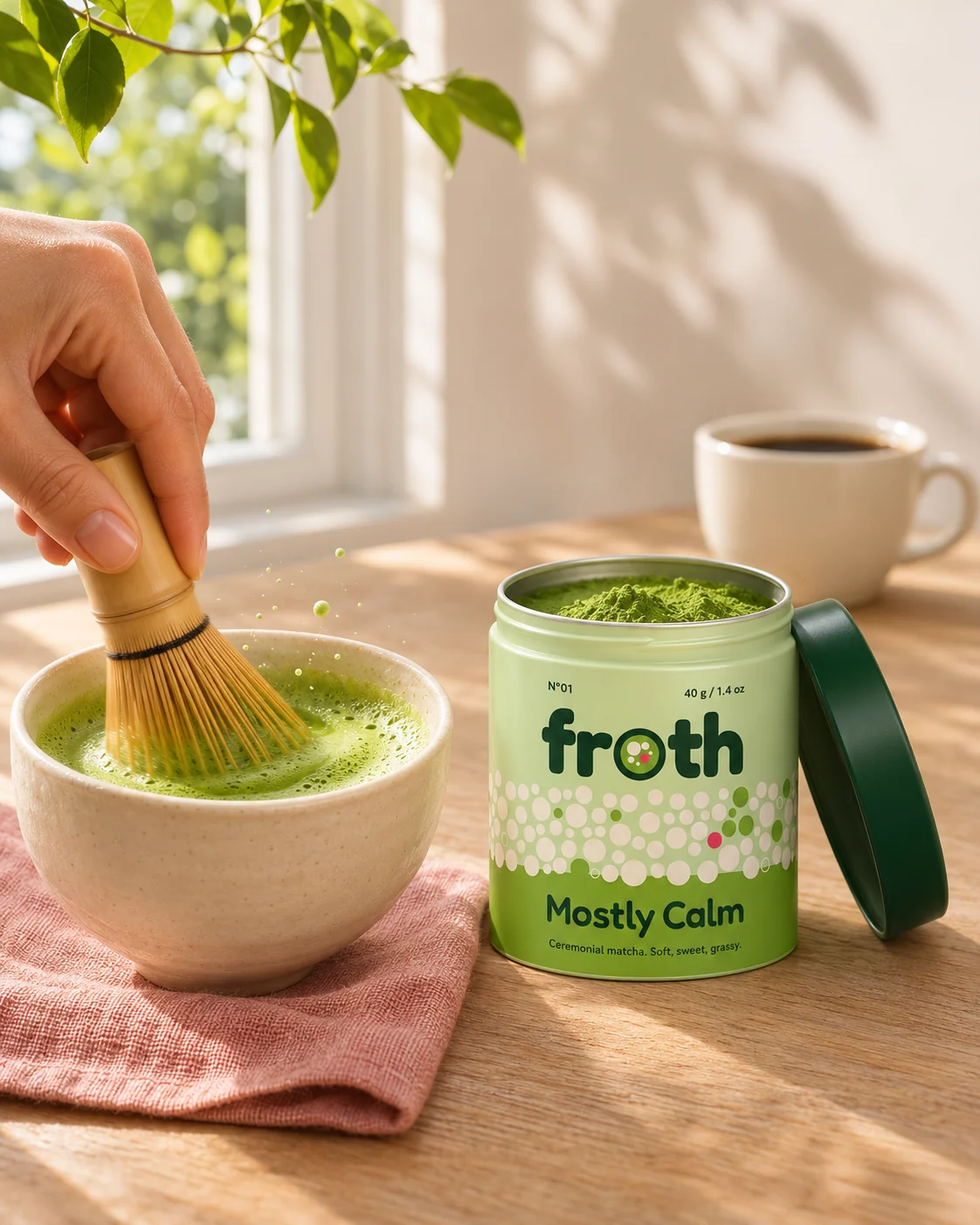
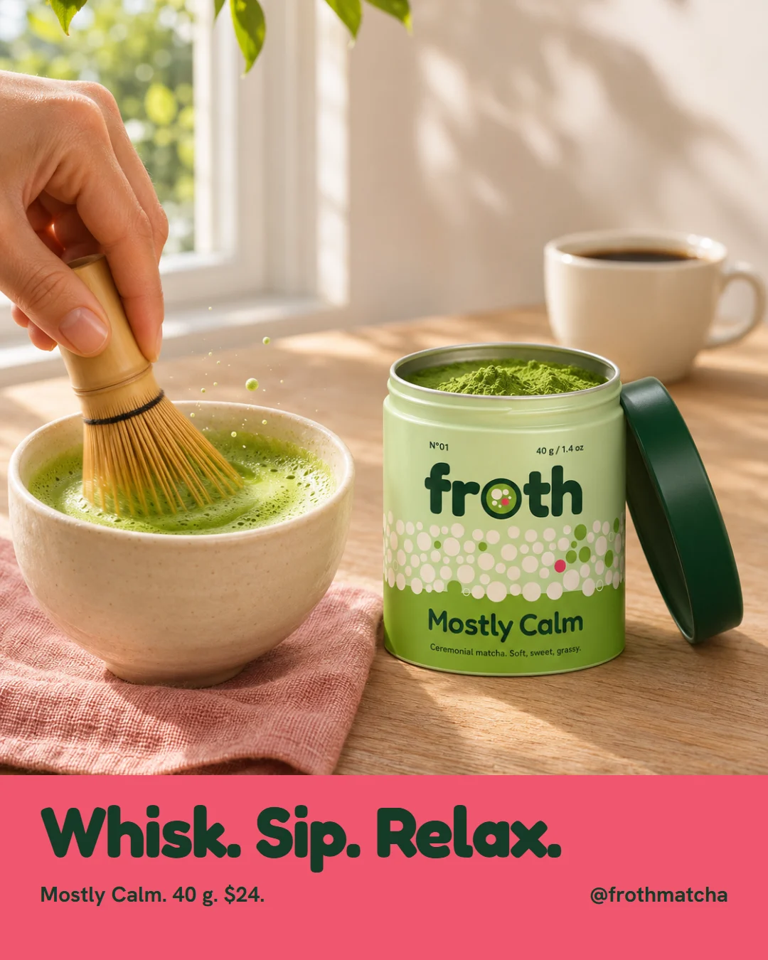
- A hand whisks matcha in a bowl next to a tin, while a cup of coffee goes cold behind it.
 BeforeAfter
Social post
- Before
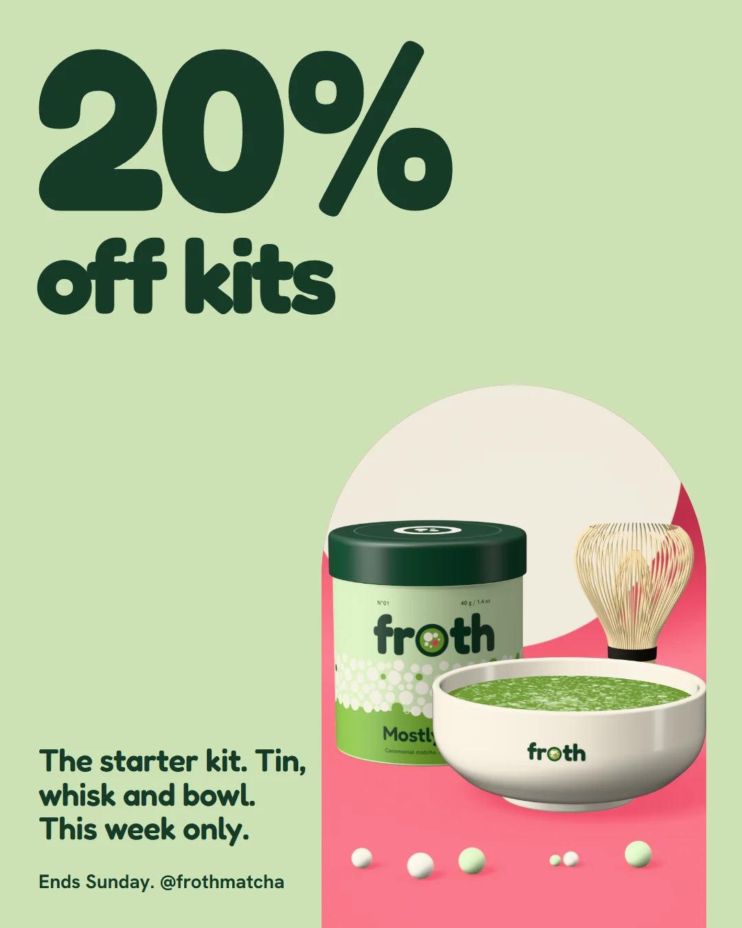
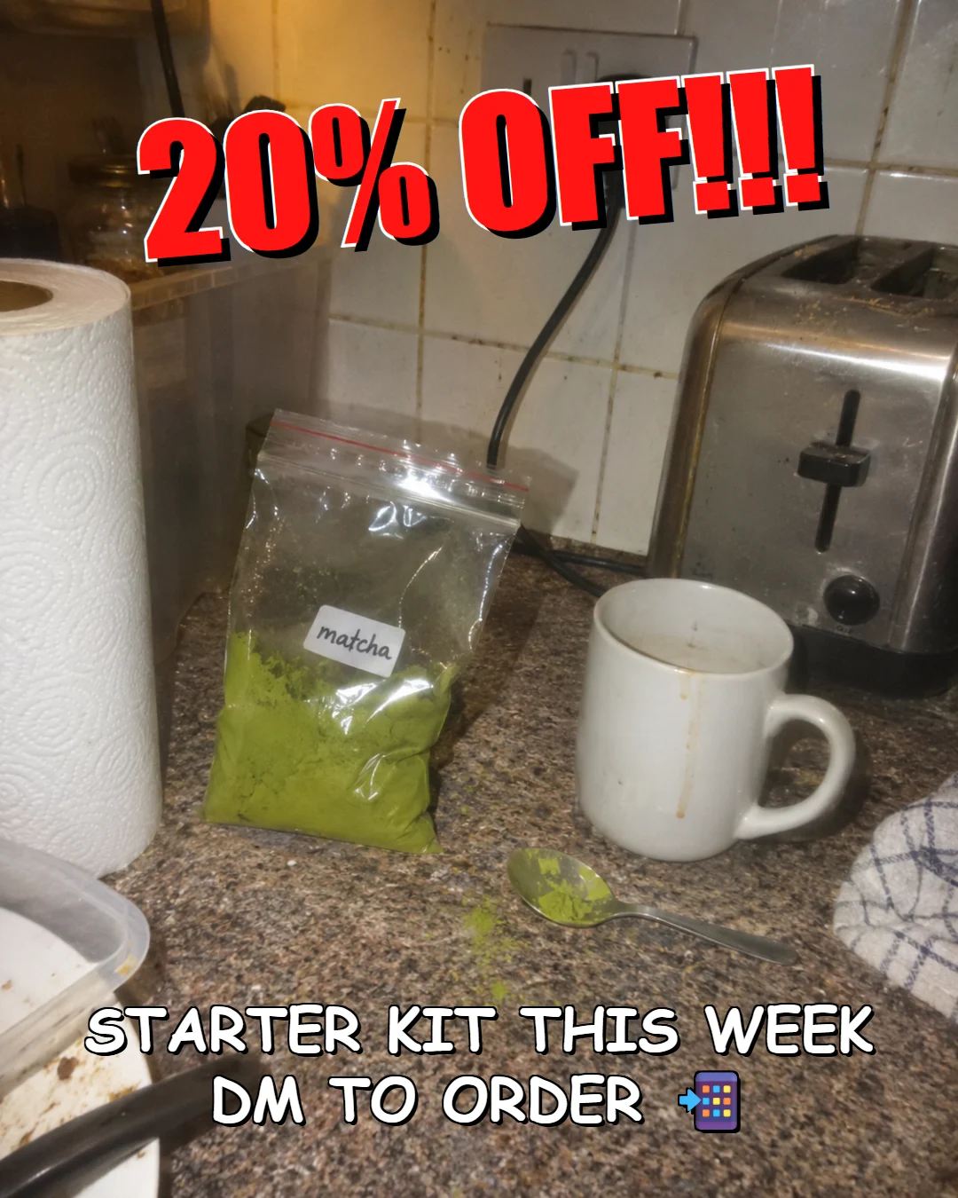
- 20% off, shouted in red over the kitchen photo.
- After
- The same offer, with the tin, the whisk and the bowl, and one big number.
Everything in the project.
Product images
The Shopify store
Banners
Social
Campaign images