dawdle
Good things take their time.
Coffee. Logo, packaging, store, banners, social, print
 BeforeAfter
- Before
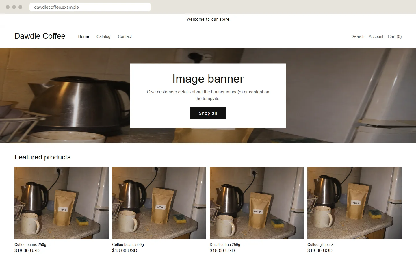
- A store theme nobody touched, and one phone photo used four times.
- After
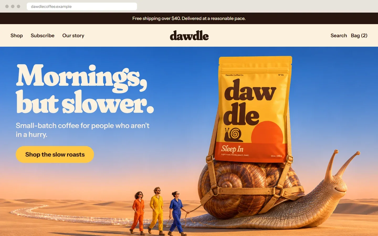
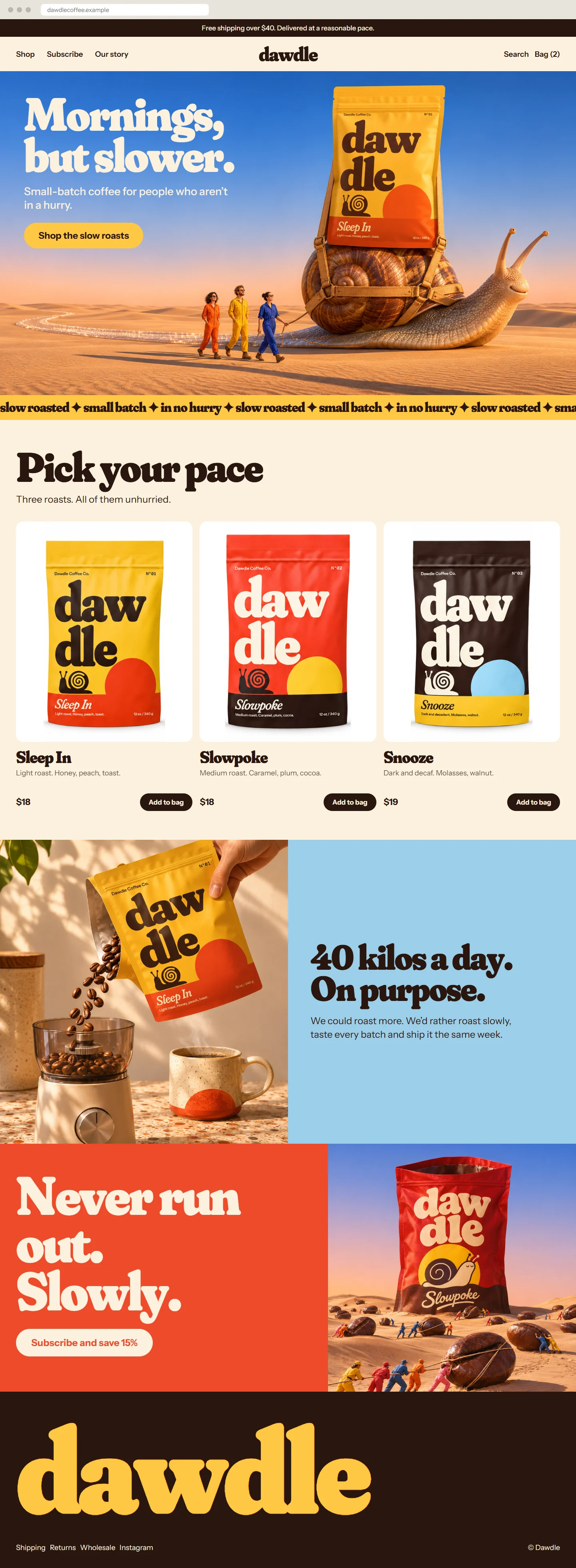
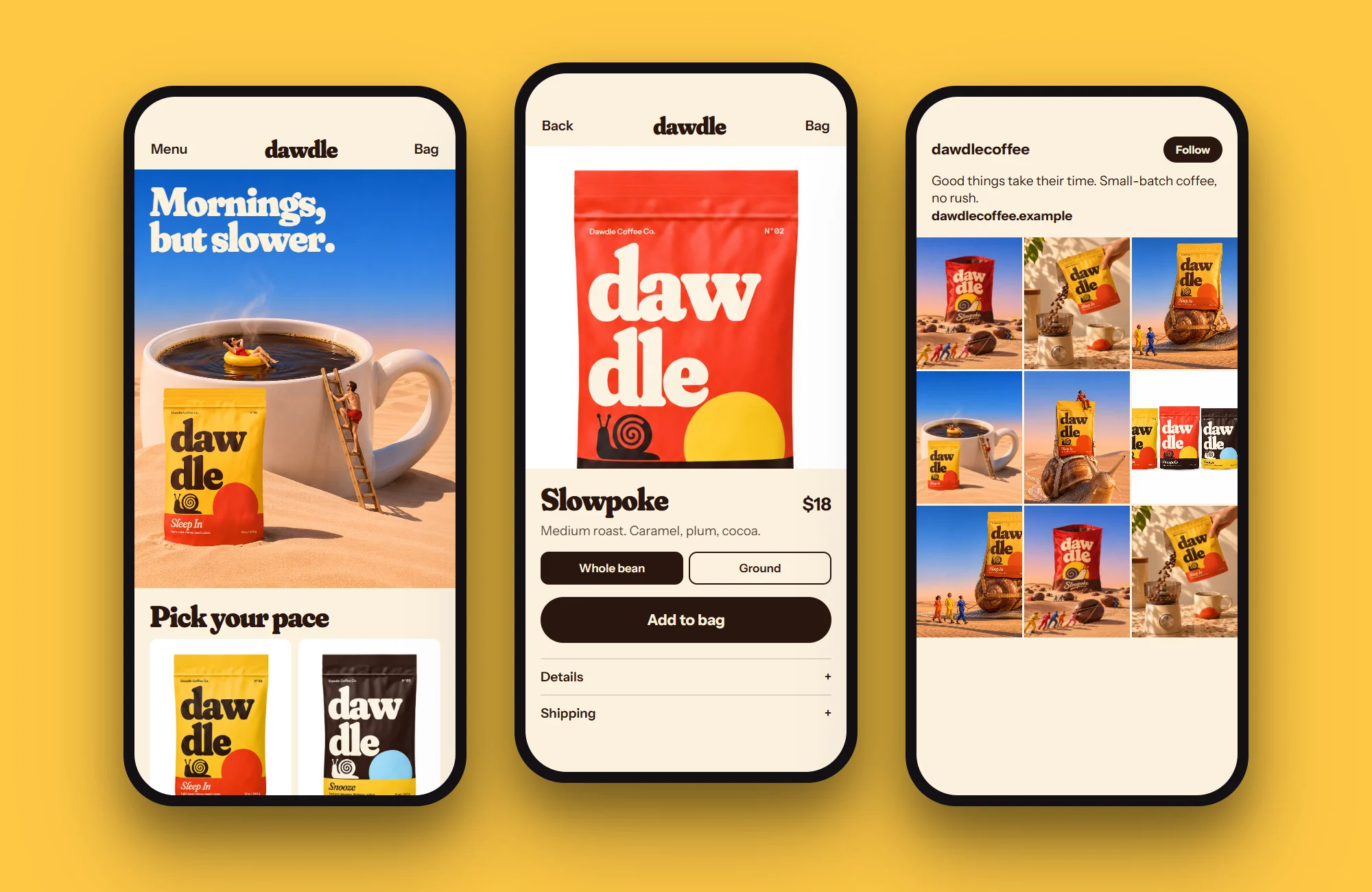
- A Shopify home page with its own voice, banner and product range.
This shop is not real. I made it to show what a full project looks like, and I made the “before” versions too. The name, products, prices and addresses are invented.
The idea
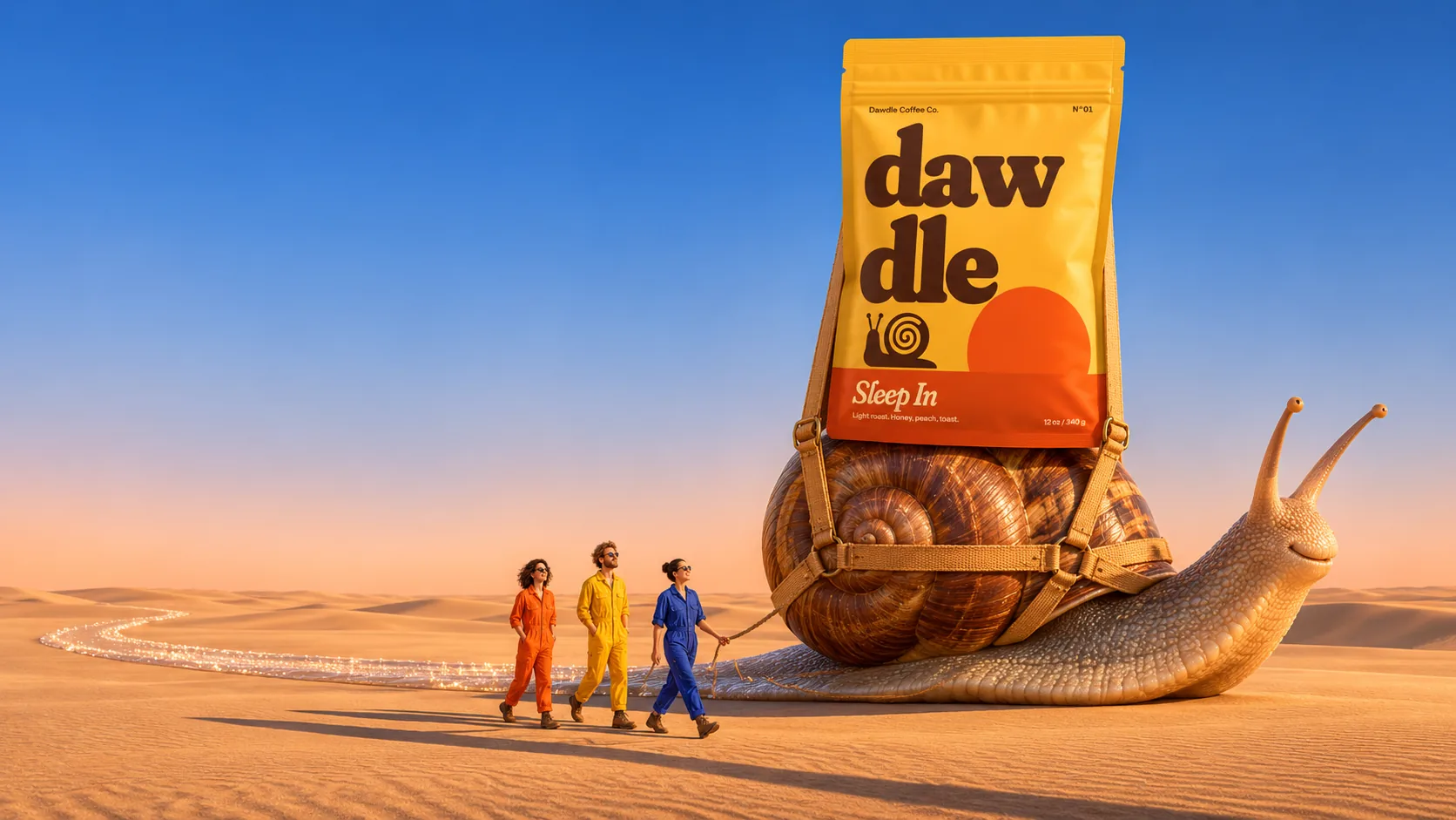
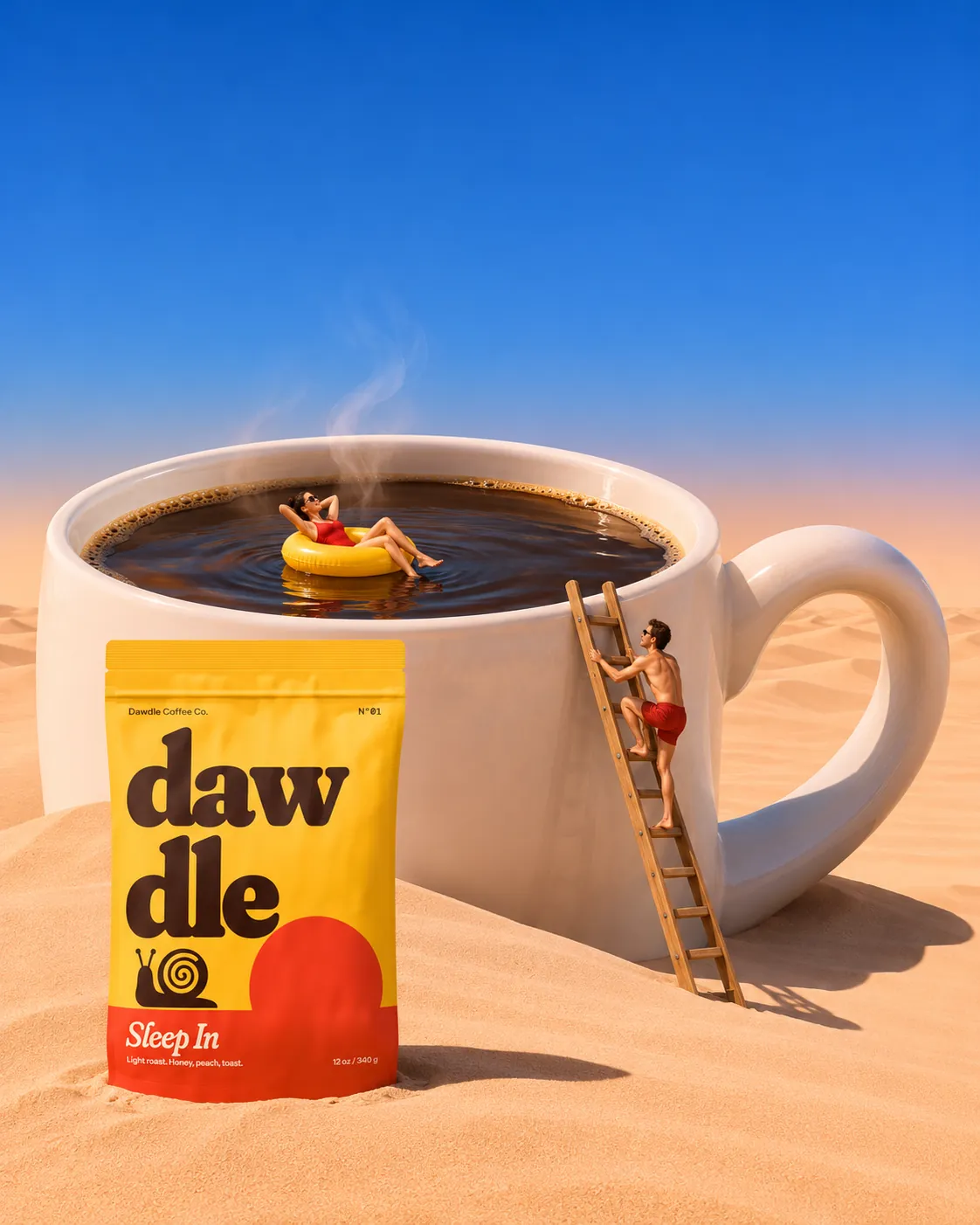
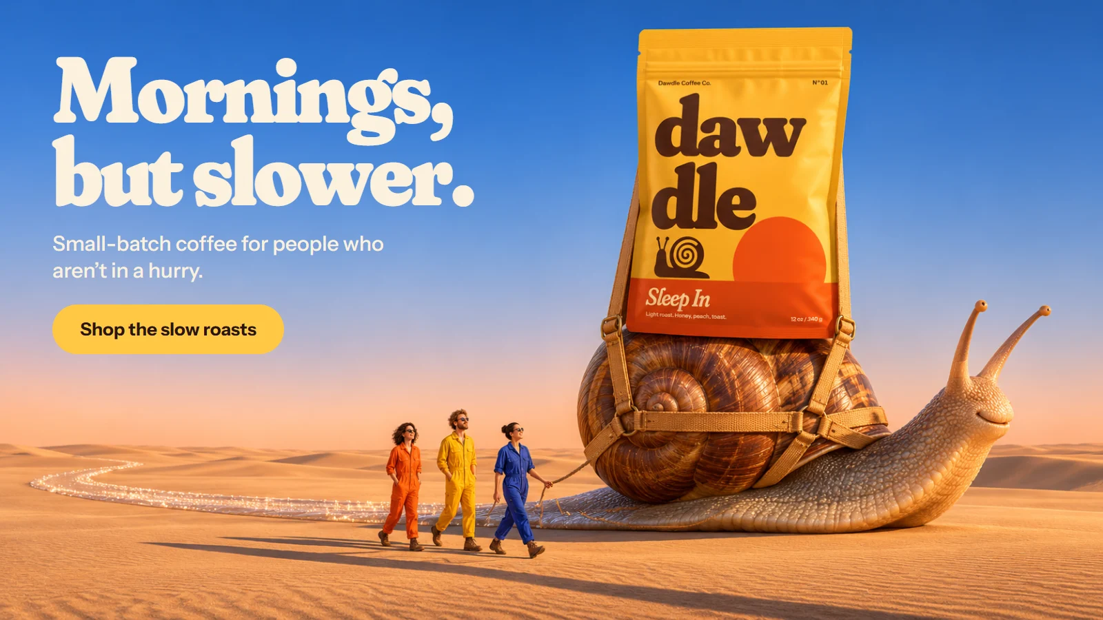
A coffee brand for people who refuse to hurry. A snail for a mascot and soft, heavy letters say it before the words do, and in the campaign that snail carries the bag across a desert at its own speed. Warm, funny and in no rush at all.
- Category
- Coffee
- Typefaces
- Fraunces, Instrument Sans, DM Mono
- Colours
- Tomato, Butter, Cream, Espresso, Sky
Piece by piece, before and after.
 BeforeAfter
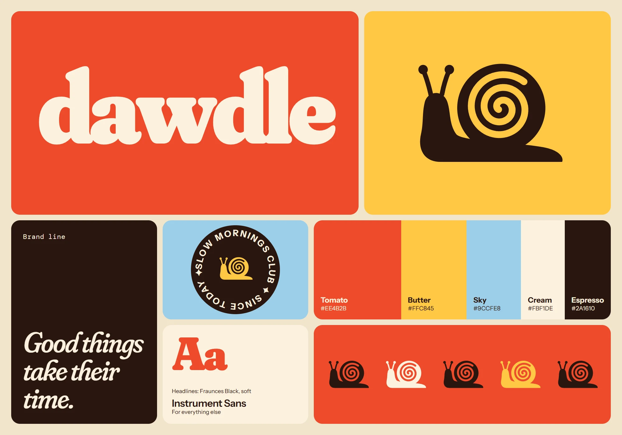
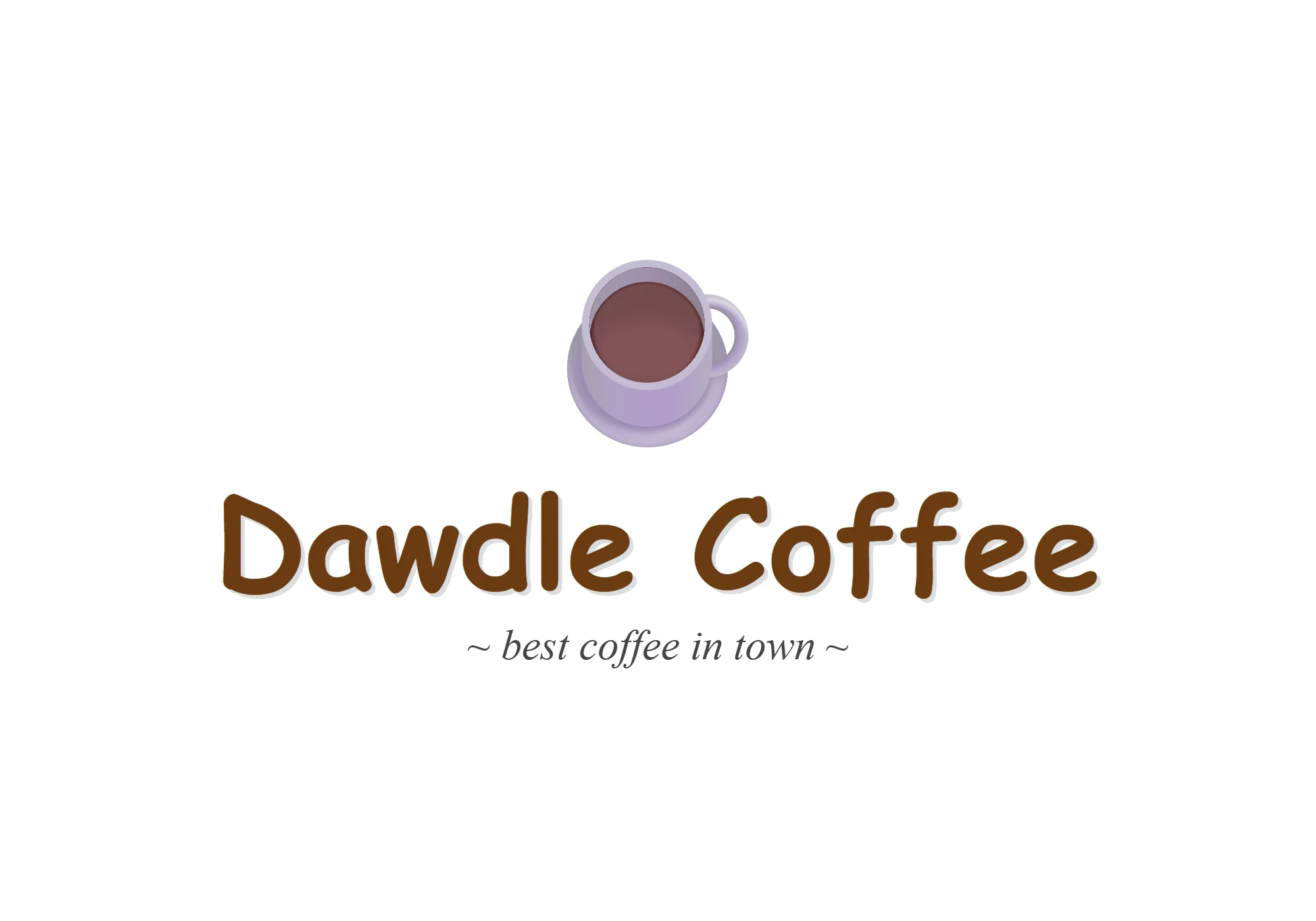
Logo and brand kit
- Before
- The name typed in a free font, under a coffee cup emoji.
- After
- A soft, heavy wordmark with a snail, plus colours and type for everything else.
 BeforeAfter
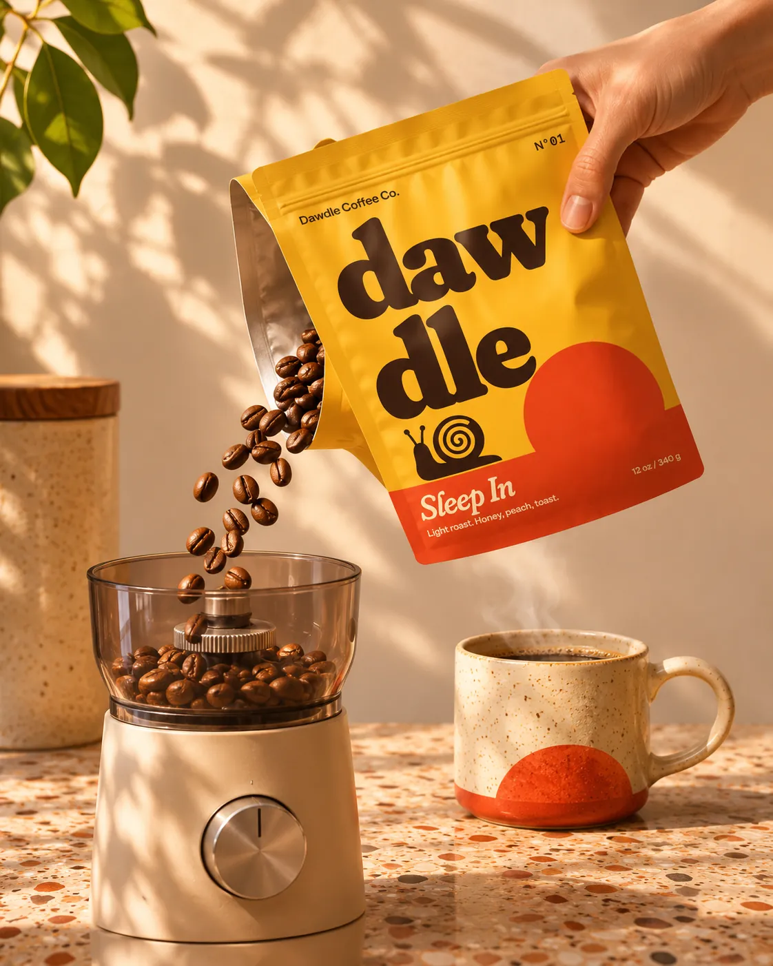
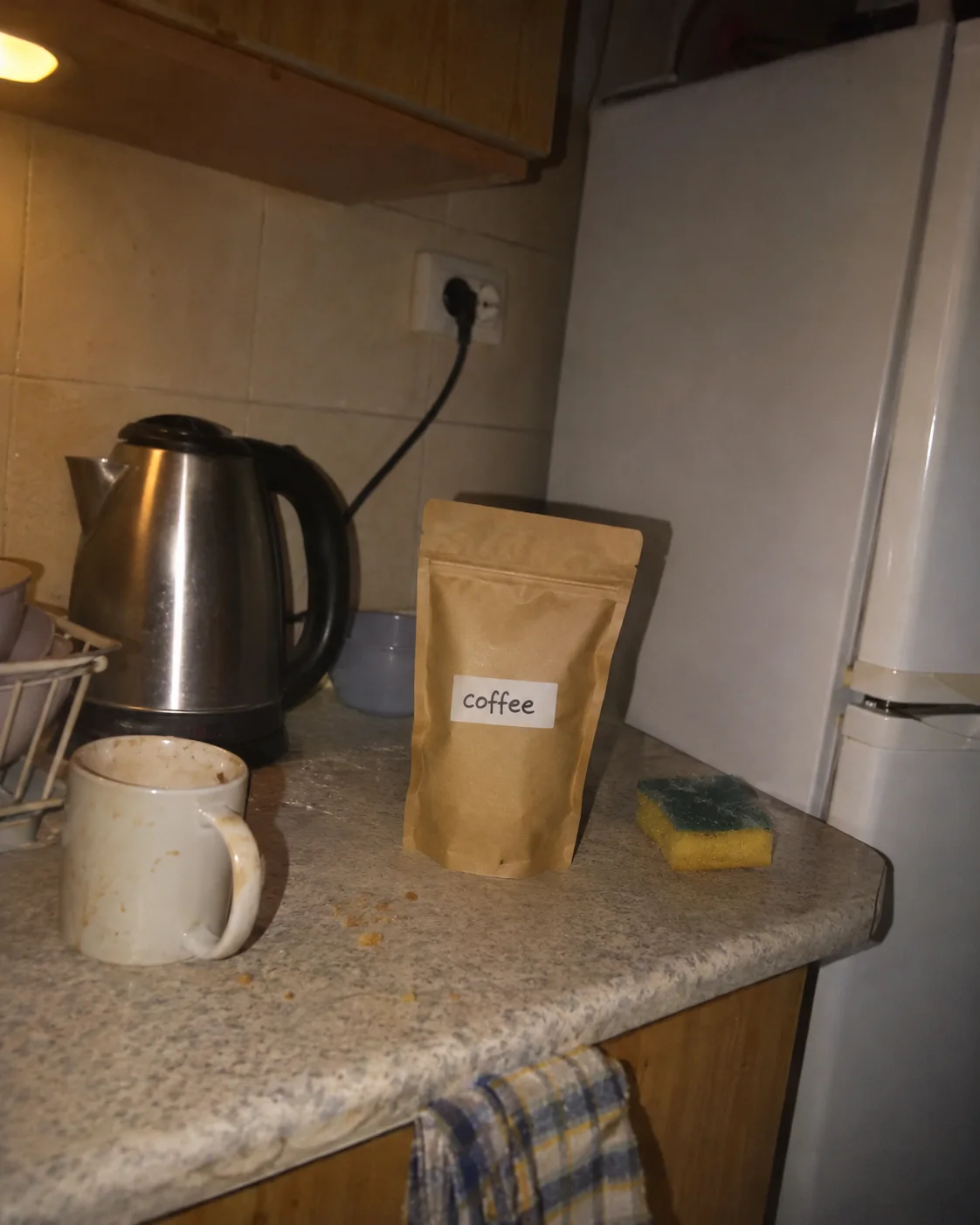
Packaging and product photo
- Before
- A brown pouch with a handwritten sticker, next to the kettle, with the flash on.
- After
- Printed pouches and a lifestyle shot in morning light.
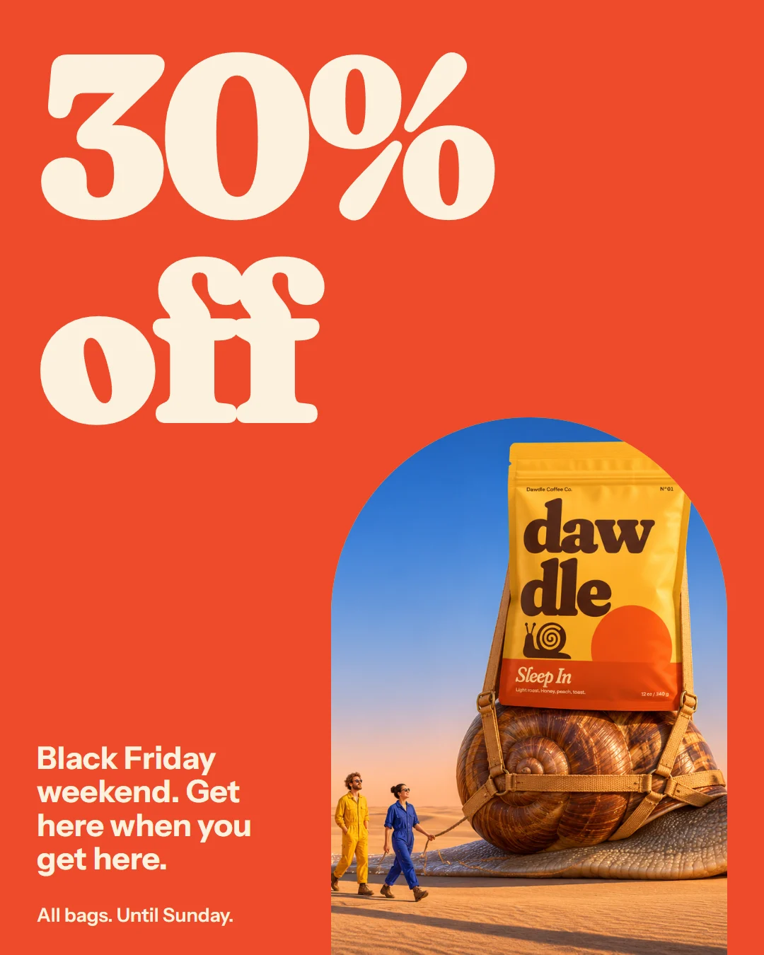
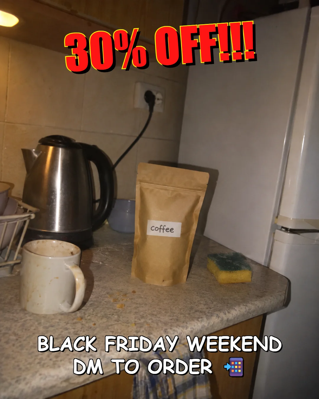 BeforeAfter
Social post
- Before
- 30% off, shouted in red over the kitchen photo.
- After
- The same 30% off, as a post people can read in one second.
Raw clipMy edit
The Reel
- Before
- Five phone clips from one slow morning at home.
- After
- A 20-second how-to with a hook, captions, voice, music and sound.
Press play, then drag the line. I staged the raw clip too.
Everything in the project.
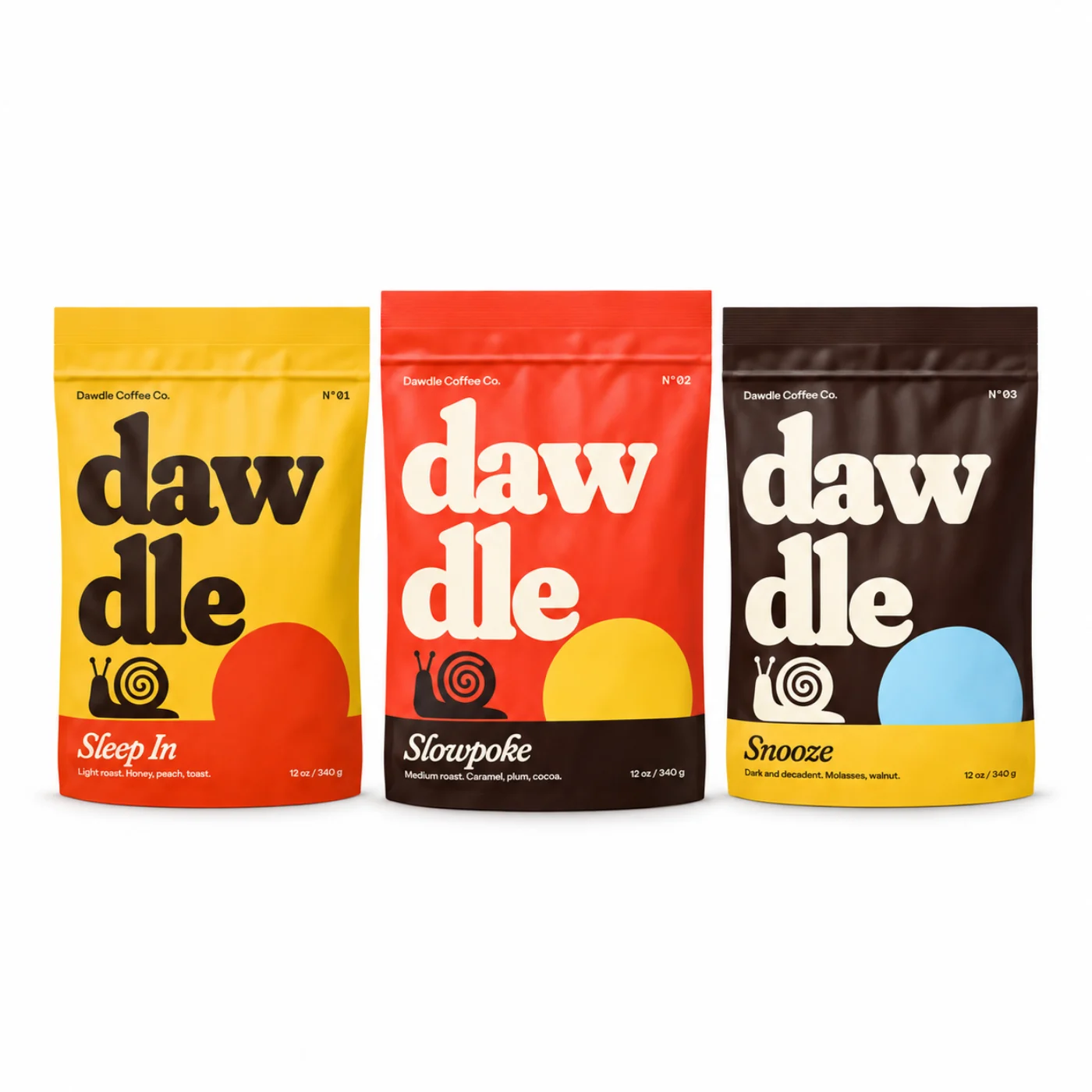
Product images
The Shopify store
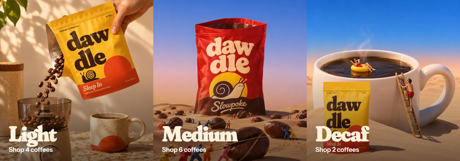
Banners
Social
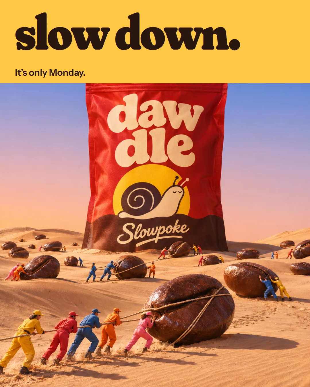
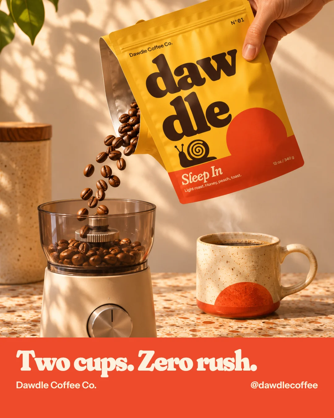
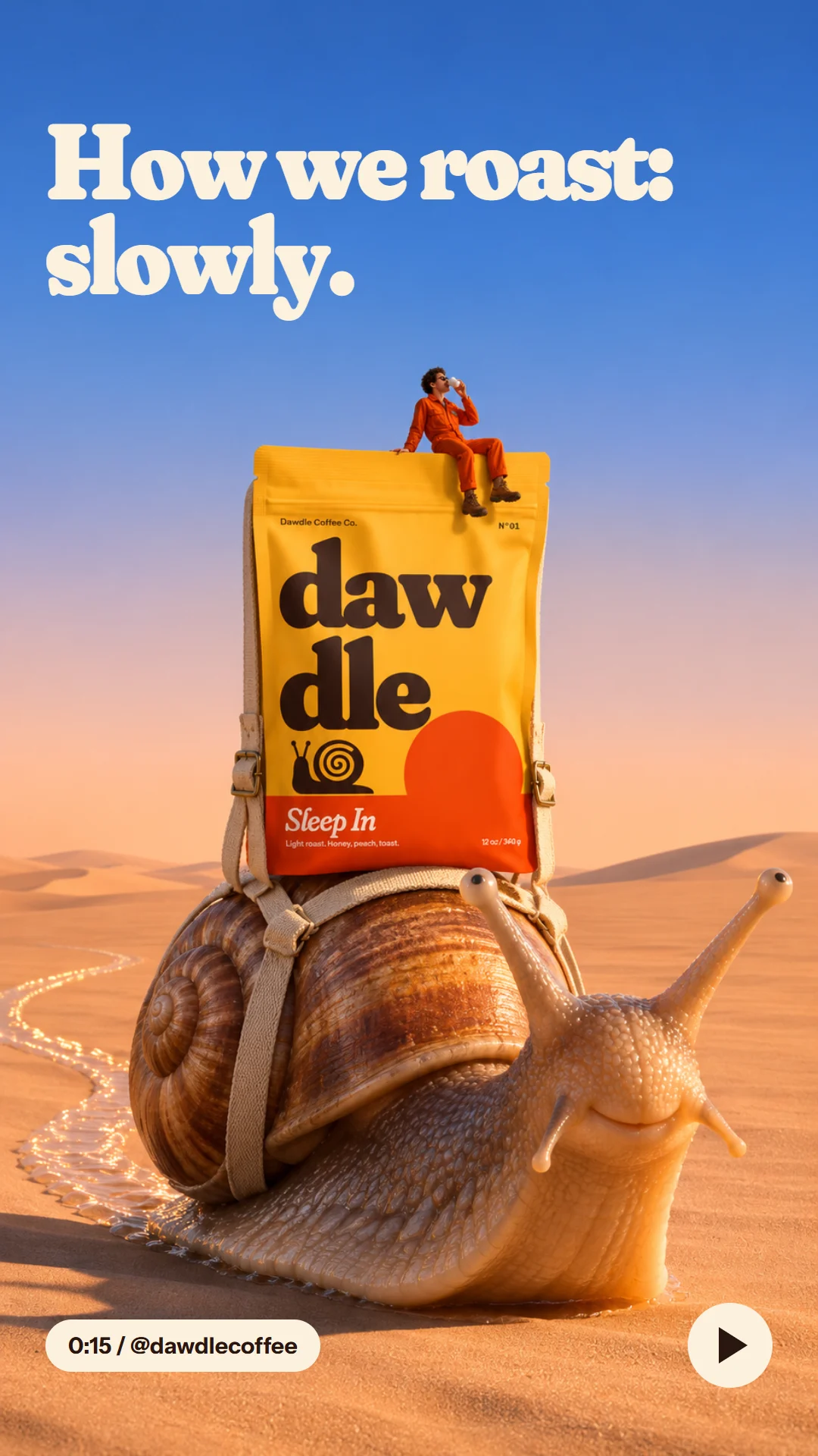
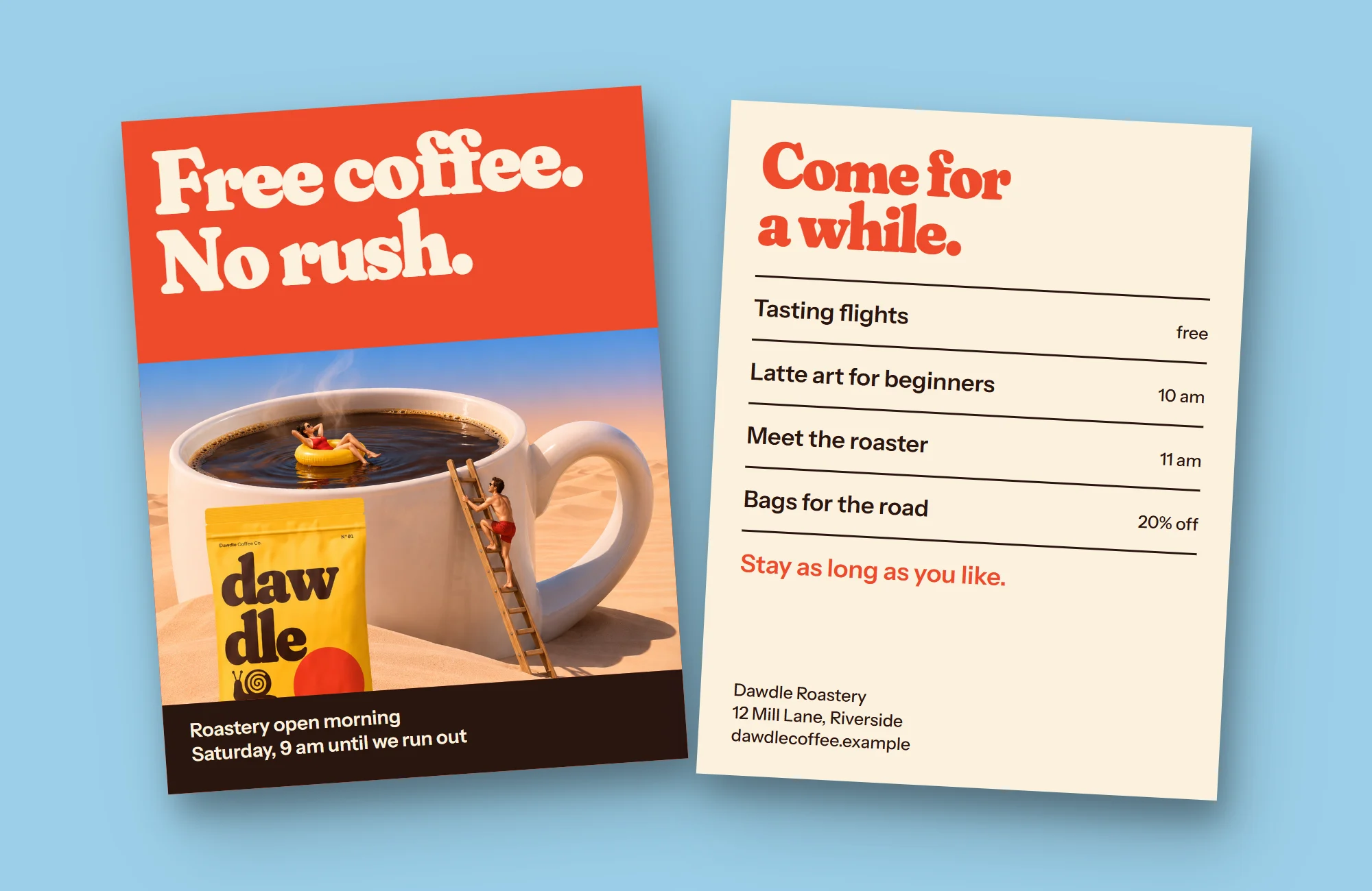
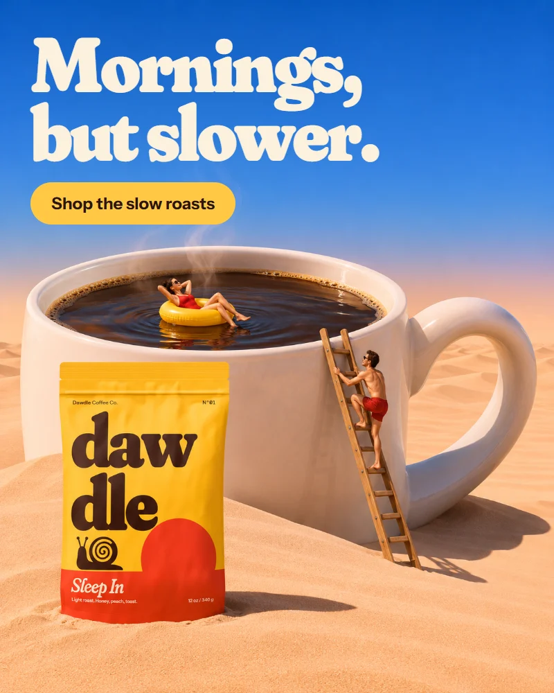
Campaign images